Selected Work

Case studies

Three projects from my time leading research at Ocado Technology, spanning product strategy, research operations, and 0-to-1 product development.

Product Strategy · Conversion

First Time Shopper

Ocado Technology · 2025–2026 · UK, Canada, Japan & Spain — 4 of Ocado's 8+ international markets

Illustration of a grocery store transitioning into an online grocery app — half physical shop shelves, half a mobile grid of grocery items
From physical aisles to a digital basket.

Getting the first shop right is critical for customer acquisition and retention in online grocery. In 2025, I co-led a global research initiative — alongside a fellow Senior UX Researcher — to deeply understand the First Time Shopper (FTS) experience across four markets and retail partners: the UK (Ocado Retail), Canada (Sobeys/Voilà), Japan (Aeon/Green Beans), and Spain (Alcampo).

Project goal

The goal was to uncover how easy or hard it is for new customers to register, build a first basket, and complete a shop — and turn that into a clear, high-impact 2026 product strategy.
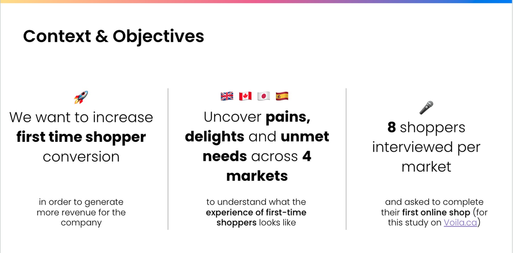
Context and objectives slide: increase first-time shopper conversion to generate more revenue; uncover pains, delights, and unmet needs across 4 markets; 8 shoppers interviewed per market and asked to complete their first online shop
Context & objectives: increasing first-time shopper conversion, uncovering pains, delights, and unmet needs across 4 markets, with 8 shoppers interviewed per market.

Summary and challenge

Data analysis showed registration-to-order conversion varying significantly by market, and interviews surfaced consistent themes of friction and basket abandonmentpoor usability, aggressive registration walls, and unexpected delivery logistics chief among them. Moving the roadmap meant the research had to do more than report findings: it had to build shared urgency across an entire product organization.

1Strategic alignment: the Questions Workshop
Questions Workshop title slide: Ordering Questions Workshop, Goal 1: Increase FTS conversion
Kickoff slide for the Questions Workshop, aligning the Ordering product area on Goal 1: increase FTS conversion. Designed by Jesica Sánchez, UX Designer.

Before running a single interview, we brought together PMs, UX Designers, and Data Analysts for a "Questions Workshop" to map the current journey, surface what the team already knew, and align on the questions that mattered most. The data team shared existing behavioral signals, which immediately highlighted the gaps in our qualitative and quantitative understanding — that gap became the brief for the research.

Workshop objectives

  • 1. Map the current journey
  • 2. Surface what the team already knew
  • 3. Align on the questions that mattered most
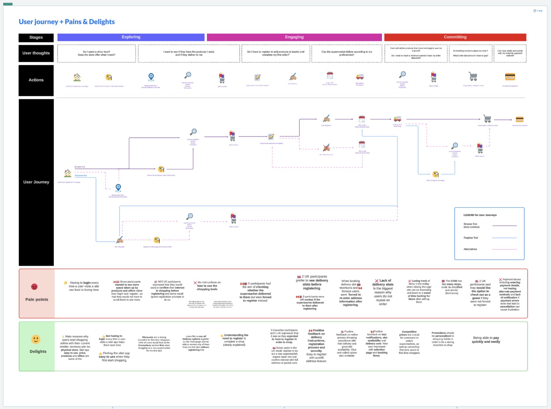
Early user journey map showing stages, user thoughts, actions, pain points and delights, used as a starting point for the Questions Workshop
Setting the scene: the team's initial view of the journey going into the workshop — thoughts, actions, pain points, and delights as understood at the time, before checking data analytics and running the assumptions activity. Designed by Jesica Sánchez, UX Designer.
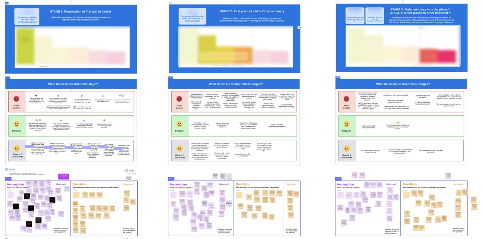
Three workshop slides showing conversion funnel charts connected to qualitative pain points, delights, and needs, plus an assumptions and questions sticky-note activity
Next, quantitative funnel data connected to qualitative pain points, delights, and needs for each stage — which then fed the Assumptions & Questions activity. Specific conversion figures are blurred for this public case study.

FTS Working Group

This alignment step led to the formation of a dedicated FTS Working Group — myself and another UX Researcher, alongside stakeholders from Product, Data Analytics, and Partner Growth. Bringing Partner Growth in from the start was a deliberate choice: it let us continuously integrate partner-side acquisition metrics and business priorities, so our recommendations stayed grounded in commercial reality, not just user needs.
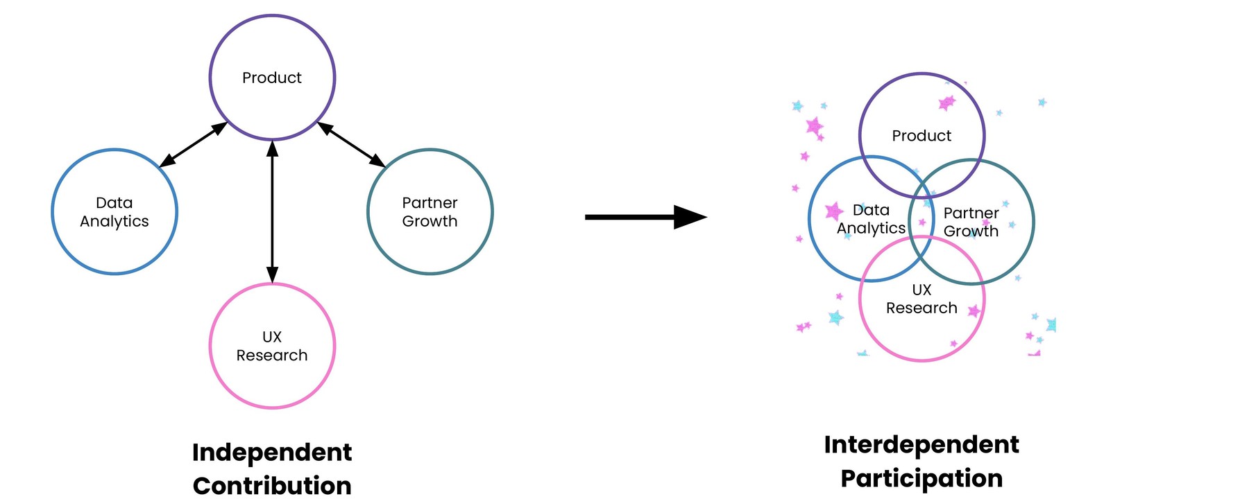
Diagram showing the shift from independent contribution — Product, Data Analytics, Partner Growth, and UX Research working separately — to interdependent participation, shown as overlapping circles for all four functions
From coordination to collaboration: the FTS Working Group moved Product, Data Analytics, Partner Growth, and UX Research from independent contribution to interdependent participation.

2Two global workstreams, mixed methods

With a clear brief, the research split into two complementary workstreams, plus competitive benchmarking to sanity-check our findings against the market:

  • "First Shop": 32 moderated in-depth interviews (8 per market) with simulated shop-along tasks and direct behavioral observation across the UK, Canada, Japan and Spain.
  • "Registered Not Shopped" (RNS): surveys and follow-up interviews targeting users who created an account but abandoned their cart, run in close collaboration with our Retail partners in the UK, Japan, and Spain to uncover exact drop-off triggers.
  • Benchmarking: analyzed 11 competitor retailers and cross-referenced qualitative findings with platform analytics to map drop-offs and size the business impact of each friction point.

Global Customer journey map

The "First Shop" workstream produced a combined customer journey map across all four markets, spanning five stages — from Landing & Discovery through to Checkout & Payment — highlighting both universal pain points and market-specific differences:
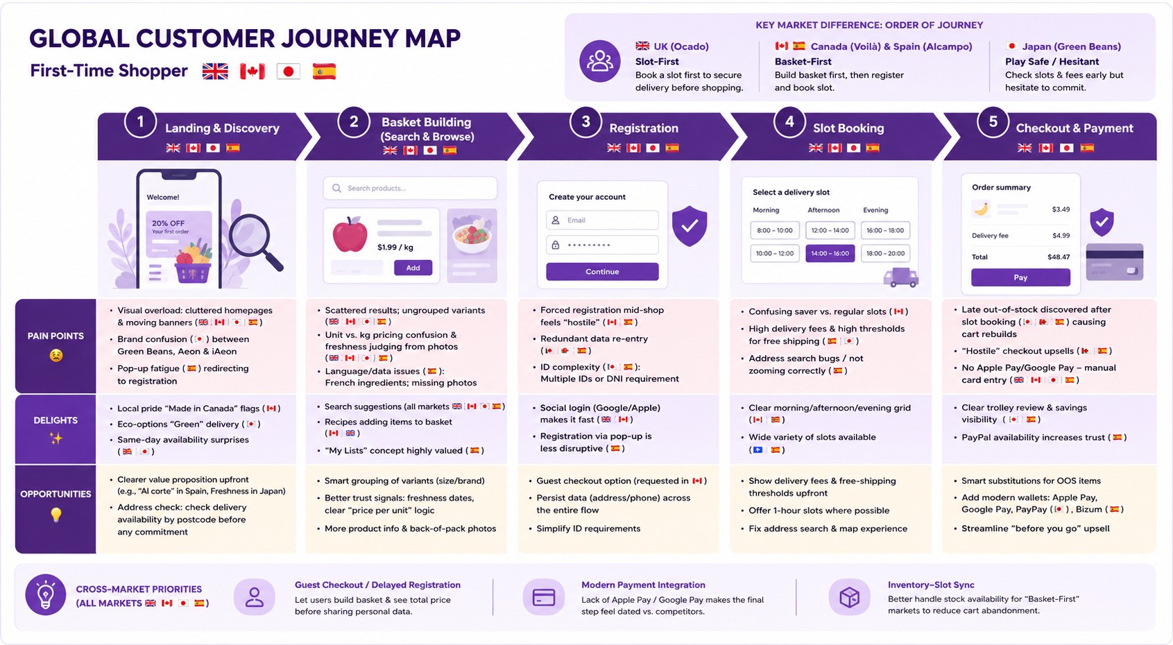
Global customer journey map for First Time Shopper across UK, Canada, Japan, and Spain, showing five stages with pain points, delights, and opportunities per market, plus key market differences in journey order and cross-market priorities
Journey map synthesized from First Shop interview transcripts and research reports across all four markets, visualized with the help of AI. Highlights the key difference in journey order across markets — UK is slot-first, Canada and Spain are basket-first, Japan is play-safe/hesitant — alongside stage-by-stage pain points, delights, and opportunities.

Full text of the journey map image, for screen readers:

Stage 1: Landing & Discovery. Goal: understand the offer, find offers, start shopping.

  • Pain — Visual overload: cluttered, overwhelming homepages and moving banners felt like too much information, across all markets (Canada, Japan, Spain, UK).
  • Pain — Brand confusion (Japan): unclear relationship between Green Beans, Aeon, and iAeon.
  • Pain — Pop-up fatigue (Spain): intrusive banners redirecting straight to registration.
  • Delight — Local pride (Canada): "Made in Canada" flags and local-product callouts.
  • Delight — Eco-options (Japan): "green" delivery slot options.
  • Delight — Same-day availability (Spain, Japan): surprise at seeing same-day slots.
  • Opportunity — Clearer value proposition: explain upfront why to shop here (e.g. "Al corte" in Spain, freshness in Japan).
  • Opportunity — Address check: let users check delivery availability by postcode before any commitment.

Stage 2: Basket Building. Goal: find specific items or browse for inspiration.

  • Pain — Scattered results: search often surfaced irrelevant items or split variants apart (e.g. 20 separate apple listings).
  • Pain — Fresh produce anxiety (Spain, Canada, Japan): confusion over unit vs. kg pricing (Spain) and difficulty judging freshness from photos (Canada, Japan, Spain).
  • Pain — Language/data issues (Spain): ingredients listed in French; missing back-of-pack photos.
  • Delight — Search suggestions: predictive search was a universal delight.
  • Delight — Recipes (Canada, UK): recipe inspiration that adds items straight to the basket.
  • Delight — "My Lists" (Spain): recurring orders/lists highly valued.
  • Opportunity — Smart grouping: group product variants (size/brand) to cut clutter in results.
  • Opportunity — Trust signals: clearer freshness dates and price-per-unit logic.

Stage 3: Registration. Goal: create an account to checkout.

  • Pain — Forced registration (Canada, Spain): felt "held hostage" when forced to register mid-shop or too early.
  • Pain — Data redundancy (Japan, Canada, Spain): re-entering address/phone already given earlier.
  • Pain — ID complexity (Japan, Spain): confusion over multiple IDs (iAeon vs. WAON) or needing a National ID (DNI).
  • Delight — Social login (Canada, UK): Google/Apple login felt fast and secure.
  • Delight — Pop-up flow (Spain): registering via a pop-up (not a page redirect) was less disruptive.
  • Opportunity — Guest checkout (Canada): pay without a full account (requested heavily in Canada).
  • Opportunity — Unified data: make address data persist through to the end.

Stage 4: Slot Booking. Goal: secure a convenient delivery time.

  • Pain — Saver slot confusion (Canada): unclear difference between saver vs. regular slots.
  • Pain — High delivery fees (Spain, Japan): high fees and free-shipping thresholds (e.g. €7 or ¥12,000) discouraged users.
  • Pain — Address bugs (Spain): "search address" buttons failing or not zooming correctly.
  • Delight — Grid layout (Canada, Spain): clear morning/afternoon/evening visualization.
  • Delight — Slot variety (UK, Spain): wide range of available times.
  • Opportunity — Upfront costs: show delivery fees and thresholds before shopping starts.
  • Opportunity — 1-hour slots: move away from 3-4 hour windows where possible.

Stage 5: Checkout & Payment. Goal: review the order and pay.

  • Pain — Late out-of-stock (Japan, Canada, Spain): discovering OOS items only after booking a slot caused major frustration and basket rebuilding.
  • Pain — Hostile checkout walk (UK): "before you go" upsells felt intrusive, burying the Pay button.
  • Pain — Manual entry: no Apple Pay/Google Pay meant fetching physical cards, across all markets (Canada, Japan, Spain, UK).
  • Delight — Trolley clarity (Canada, Spain): easy to review items and see savings.
  • Delight — PayPal (Spain): availability increased trust.
  • Opportunity — Smart subs: immediate alternatives for OOS items within checkout.
  • Opportunity — Modern pay (Japan, Spain): Apple Pay, Google Pay, and local wallets (PayPay in Japan, Bizum in Spain).

Key market difference in journey order: the UK (Ocado) follows a slot-first journey — booking a delivery slot first to secure delivery before shopping. Canada (Voilà) and Spain (Alcampo) follow a basket-first journey — building the basket first, then registering and booking a slot. Japan (Green Beans) is play-safe/hesitant — checking slots and fees early but hesitating to commit.

Cross-market priorities (all markets): guest checkout/delayed registration — let users build a basket and see the total price before sharing personal data; modern payment integration — the lack of Apple Pay/Google Pay makes the final step feel dated versus competitors; inventory-slot sync — better handle stock availability for basket-first markets to reduce cart abandonment.

3Cross-market insights: one product, three mental models

The most important finding wasn't a single pain point — it was that a "one-size-fits-all" product strategy was failing to accommodate distinct local mental models for how people approach a first shop.
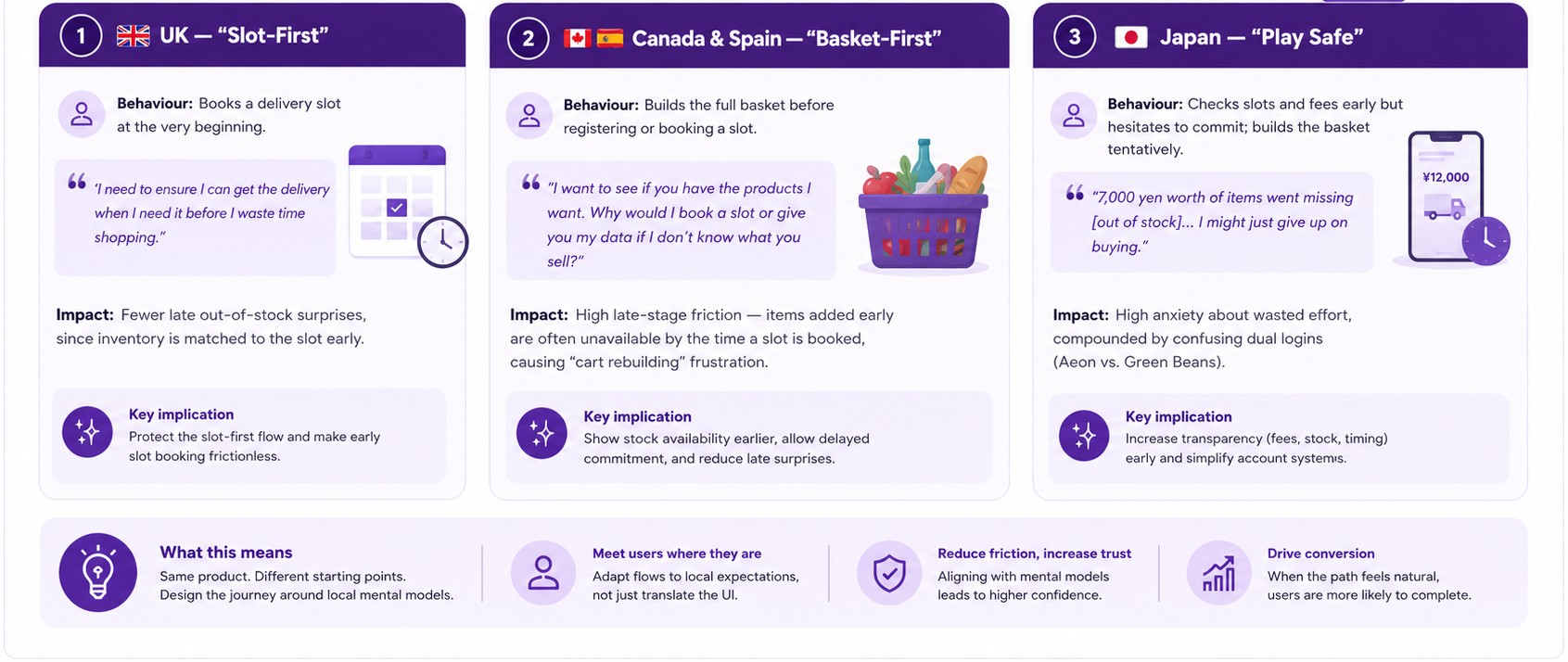
Three mental model frameworks: UK Slot-First, Canada and Spain Basket-First, and Japan Play Safe, each showing user behavior, a representative quote, impact, and key implication
Mental model framework synthesized from First Shop research across all four markets, visualized with the help of AI.

Full text of the mental model framework image, for screen readers:

1. UK — "Slot-First". Behavior: books a delivery slot at the very beginning. Quote: "I need to ensure I can get the delivery when I need it before I waste time shopping." Impact: fewer late out-of-stock surprises, since inventory is matched to the slot early. Key implication: protect the slot-first flow and make early slot booking frictionless.

2. Canada & Spain — "Basket-First". Behavior: builds the full basket before registering or booking a slot. Quote: "I want to see if you have the products I want. Why would I book a slot or give you my data if I don't know what you sell?" Impact: high late-stage friction — items added early are often unavailable by the time a slot is booked, causing "cart rebuilding" frustration. Key implication: show stock availability earlier, allow delayed commitment, and reduce late surprises.

3. Japan — "Play Safe". Behavior: checks slots and fees early but hesitates to commit; builds the basket tentatively. Quote: "7,000 yen worth of items went missing [out of stock]... I might just give up on buying." Impact: high anxiety about wasted effort, compounded by confusing dual logins (Aeon vs. Green Beans). Key implication: increase transparency (fees, stock, timing) early and simplify account systems.

What this means: same product, different starting points — design the journey around local mental models. Meet users where they are by adapting flows to local expectations, not just translating the UI. Aligning with mental models reduces friction and increases trust and confidence. When the path feels natural, users are more likely to complete their purchase, driving conversion.

"I usually don't create an account on the first go unless I really have to." — a Canadian user, summing up the registration barrier felt across every market

In the UK and Spain specifically, the multi-page cross-sell "Checkout Walk" presented just before payment was perceived as hostile and overly long — and across every region, the absence of modern, trusted payment options (Apple Pay, Google Pay, Bizum) added friction at the final hurdle.

4Global synthesis & Watch Parties

In-person workshops

Findings were shared and acted on in person during two intensive workshops — Barcelona in May 2025 and Poland in late September/early October 2025 — bringing together Research, Product Analytics, and Partner Growth to co-present a single, unified picture — behavioral data, partner insight, and human story together. These sessions covered the UK, Canada, and Japan; First Shop Spain followed later, in January 2026, as a dedicated deep-dive I led independently (more on that under My Role, below).
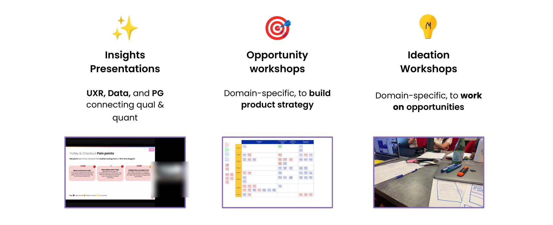
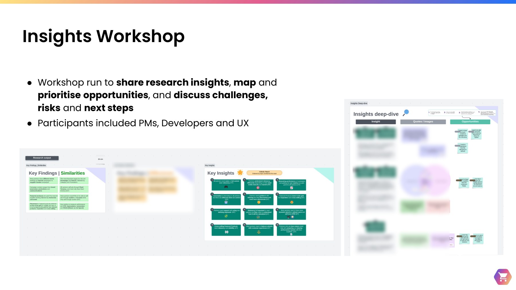
Workshops key activities: Insights Presentations bringing together UXR, Data and PG to connect qual and quant; domain-specific Opportunity workshops to build product strategy; and domain-specific Ideation Workshops to work on opportunities, each with a photo example
Key workshop activities: Insights Presentations connecting qual and quant across UXR, Data, and Product Growth; domain-specific Opportunity workshops to build product strategy; and Ideation Workshops to work through opportunities together.

UXR & Data partnership

A key part of this phase was close, ongoing collaboration with a dedicated Data Analyst, cross-referencing qualitative findings against platform analytics session by session. That kind of embedded quant-qual partnership wasn't common practice at the time, given limited data analytics capacity and competing priorities across the wider team — which made it especially valuable. I created a shared Findings / Insights / Data Questions / Next Steps framework to structure these sessions, so we could agree, stage by stage, where it was worth digging deeper into larger quantitative datasets to validate or extend what the qualitative research was showing.
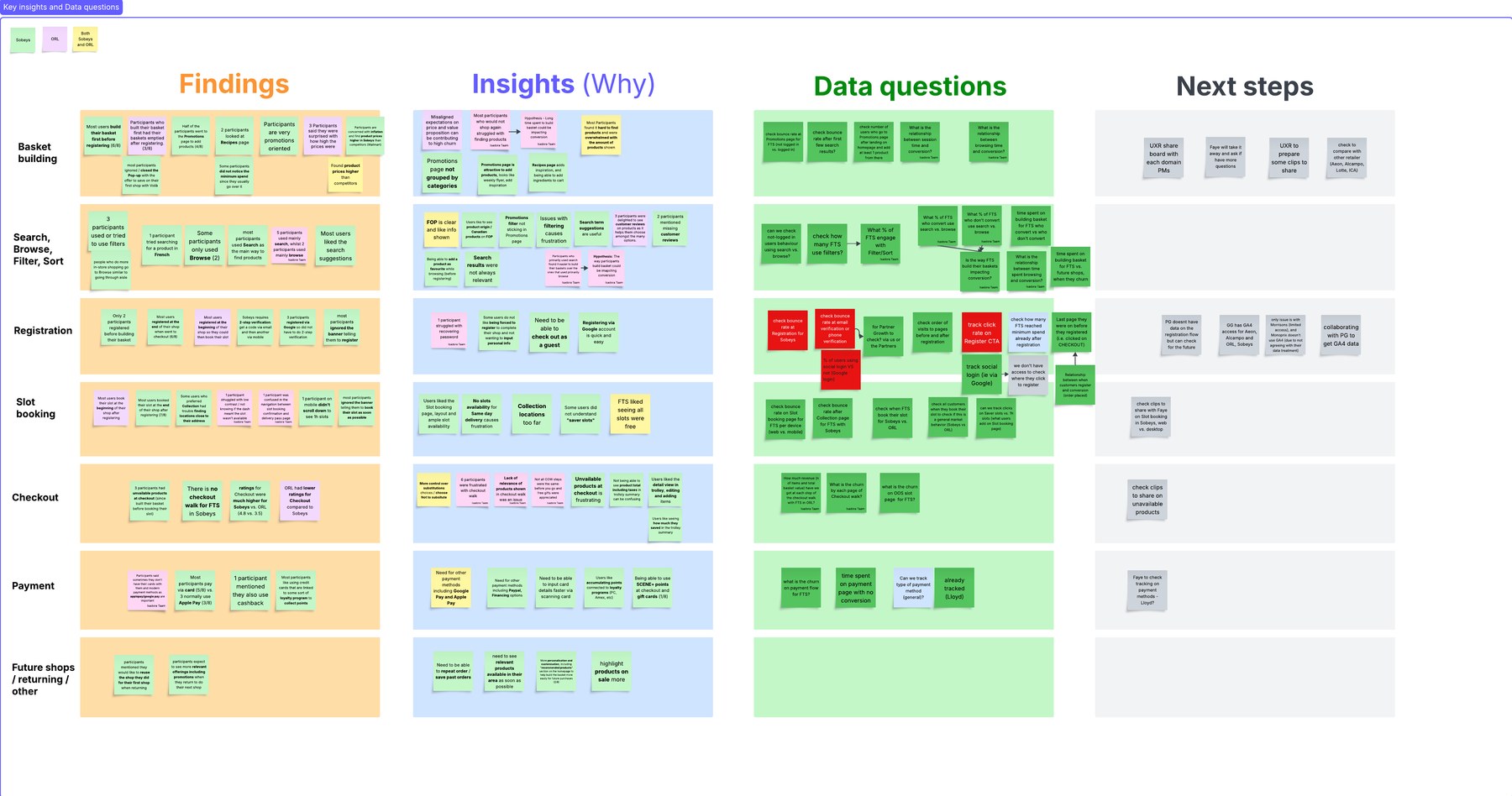
A Findings, Insights, Data Questions, and Next Steps framework board, organized by journey stage, used to align Research and Data Analytics
The Findings / Insights / Data Questions / Next Steps framework I created to structure ongoing alignment with Product and Data — agreeing, stage by stage, where to validate or deepen qualitative findings with larger quantitative datasets.

Shopping flows comparison by market

In Poland, we also laid the shopping flows of the first three markets side by side — the moment the different mental models described above became impossible to ignore.
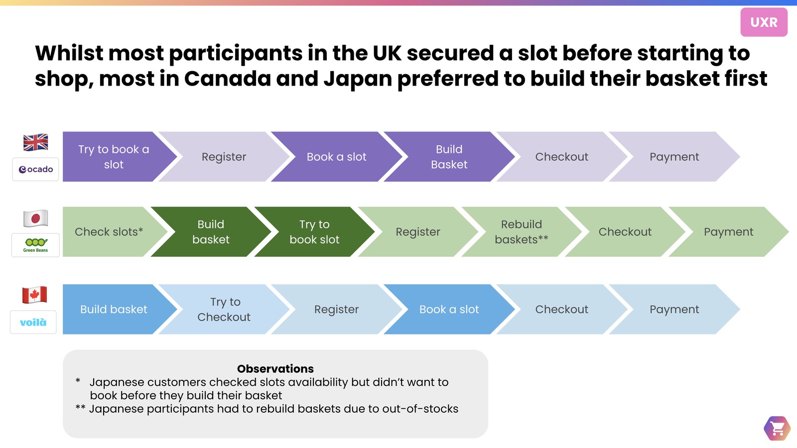
Comparison of UK, Japan, and Canada shopping flows, showing each market's order of registration, slot booking, and basket building
Comparing shopping flows across the UK, Japan, and Canada side by side in the Poland workshop, illustrating each market's distinct mental model.

Watch Parties generate empathy

Rather than presenting slides alone, we also ran UX Watch Parties: stakeholders watched real video clips of users struggling — losing basket items, searching for a voucher, saying things like "This is so painful, I could have driven to the store 13 times in this time." Watching real users struggle created a shared sense of urgency that a slide deck alone couldn't produce. Follow-up workshops, led by UX Designers and PMs, then turned those moments of friction into prioritized opportunities for the 2026 backlog.
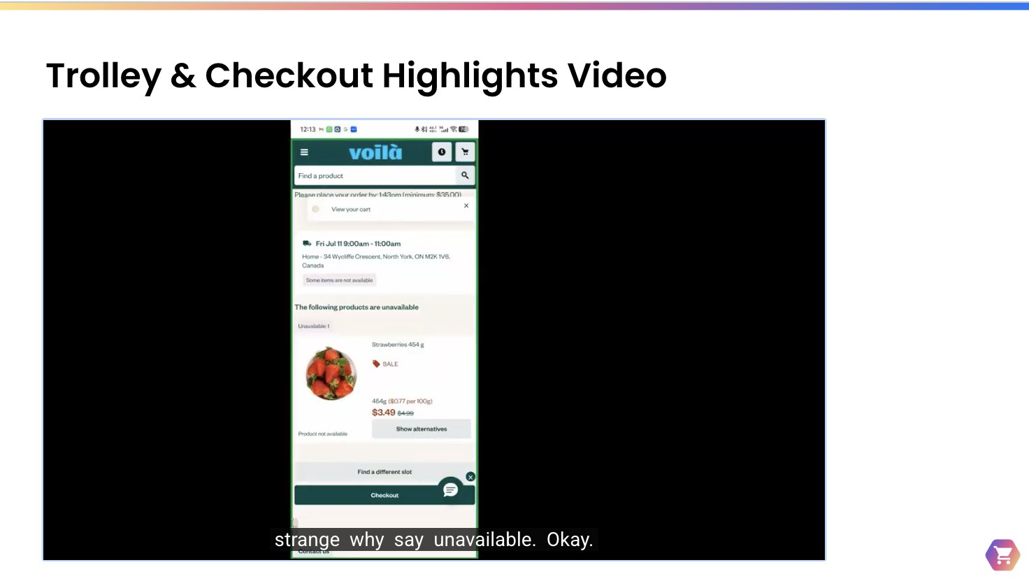
Slide titled Trolley and Checkout Highlights Video, showing a screenshot of a shopping app with a user quote
A "Trolley & Checkout Highlights" reel used in a Watch Party session — pairing real user video with direct quotes to build stakeholder empathy.

5Scaling insights with AI (NotebookLM)

With months of interviews and surveys behind us, the team faced a common researcher's challenge: how do you make a mountain of qualitative data accessible to an entire product organization?

We didn't want the insights to sit in a stagnant slide deck — we wanted a "living" research ecosystem.

I built two dedicated NotebookLM repositories — the First Shop Notebook and the RNS Notebook — centralizing every transcript, field note, and survey response from the global research. This let PMs and designers "talk" to the data directly, asking questions like "What do first-time shoppers in Canada think about registration?" and getting sourced, citable answers.

2 Dedicated NotebookLM repositories

First Shop Notebook and the RNS Notebooks, where stakeholders could interact with the data.

AI as Research Assistant

Increasing speed of analysis and synthesis while cross-checking for accuracy.

Embedded governance

Providing guidelines in the NotebookLM and in comms.

AI needs a human pilot, though. I treated it as a research assistant rather than a replacement — cross-checking every AI-generated theme against my own manual analysis for accuracy — and embedded governance into the rollout from day one: clear disclaimers on every invite and Slack share, encouraging stakeholders to verify outputs with their domain researcher rather than take them at face value. I later extended the same approach to other projects, including the On Demand project, covered in more detail in its own case study.
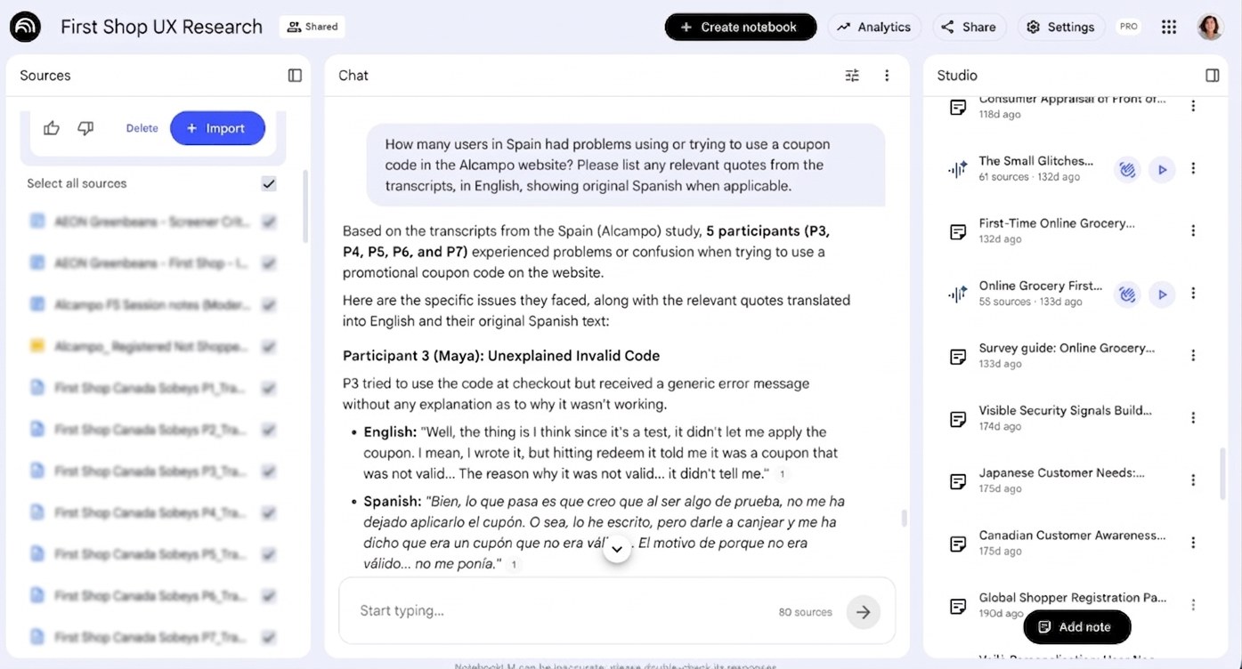
NotebookLM interface for the First Shop UX Research repository, showing a chat query about coupon code issues in Spain with cited sources
The First Shop UX Research NotebookLM — stakeholders can ask direct questions and get sourced, citable answers pulled from real interview transcripts.

6Building a research community on Slack

Insights are only valuable if they're seen. To keep momentum beyond the notebooks themselves, we launched a dedicated #FTS-insights Slack channel — posting real-time updates, inviting stakeholders to "jump in" and watch interviews as they happened, and sharing snackable interview summaries to keep empathy high in the daily scroll. A Slack Canvas served as the single source of truth for the whole initiative, linking every document, recording, and NotebookLM in one place. I led the initiative and was the main content editor for the channel.
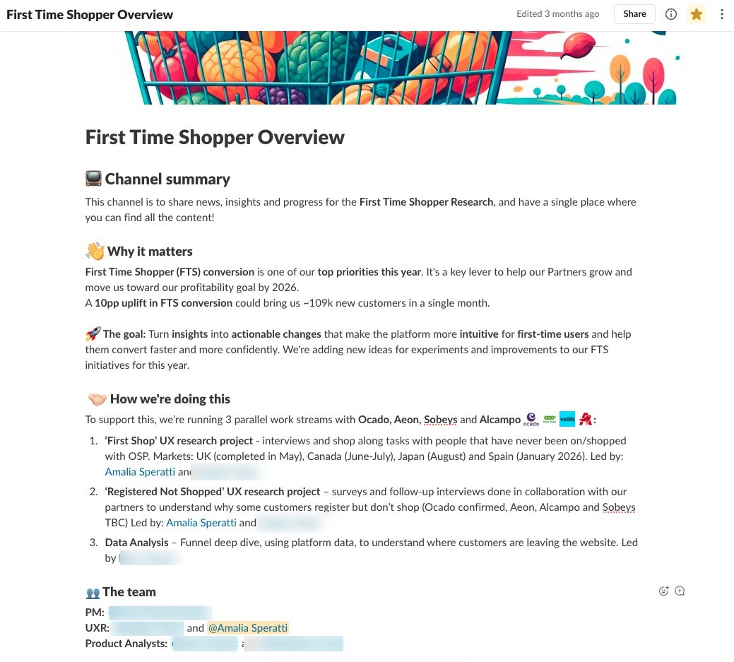
Slack Canvas titled First Time Shopper Overview, summarizing the channel's goals and the three parallel workstreams
The FTS Slack Canvas — a single source of truth linking the research goals, workstreams, and every document, recording, and NotebookLM.
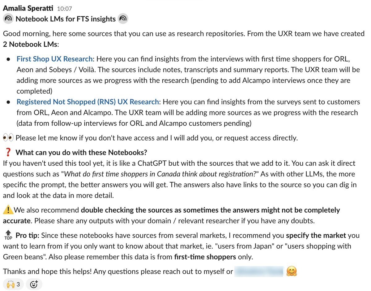
Slack announcement post introducing the two NotebookLMs, with usage tips and a disclaimer to double-check outputs
Launch announcement for the two NotebookLMs — pairing the "what it does" with clear guidance and a disclaimer to verify outputs with the domain researcher.
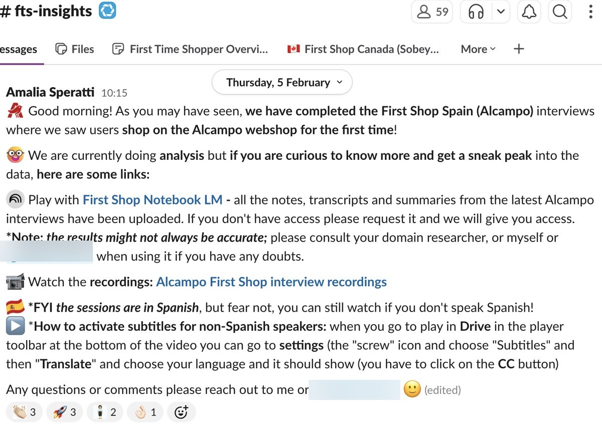
The fts-insights Slack channel, showing 59 members, pinned tabs for the First Time Shopper Overview canvas and market-specific resources, and an update post on completed Alcampo interviews
The #fts-insights channel itself — 59 members, with the Canvas and market-specific resources pinned directly in the channel tabs for easy access.
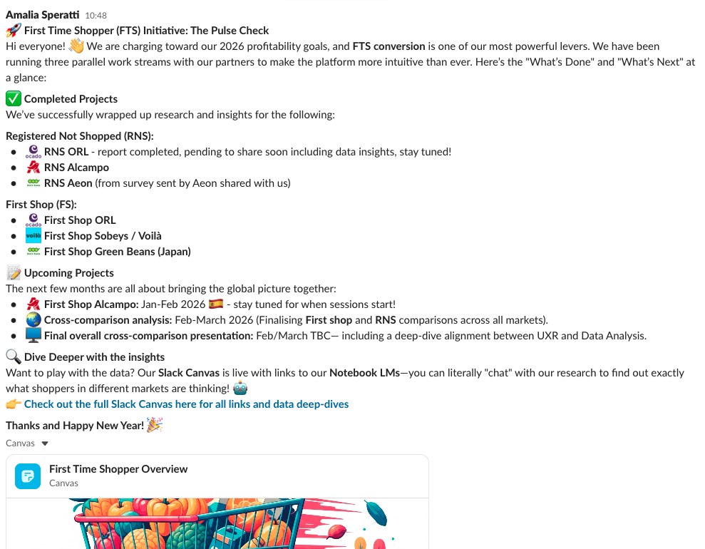
Slack post titled First Time Shopper Initiative: The Pulse Check, summarizing completed and upcoming research projects across all markets
A regular "pulse check" update — completed and upcoming research at a glance across every market, keeping the wider org aligned without anyone needing to ask.

7Impact and next steps

Influencing product strategy

The research surfaced a clear, consistent pattern: conversion from registration through to a completed order varied significantly by market, with friction concentrated around forced registration, late-stage out-of-stock surprises, and an intrusive checkout flow. UK, Canada, Japan, and Spain were selected as focus markets for direct research that year, but the resulting strategy was relevant platform-wide — reframed as a strategic opportunity, it translated into a significant double-digit conversion opportunity (+10pp, ~109K new monthly customers) across Ocado's 8+ international markets, and became the foundation for three prioritized 2026 initiatives:

  • ✅ Flexible Onboarding — removing the hard registration wall in favor of guest checkout and delayed registration, matching the "Basket-First" mental model
  • ✅ Checkout & Flow Optimization — redesigning the Checkout Walk and integrating modern digital wallet payments
  • ✅ Early Value Perception — surfacing delivery slots, shipping costs, and vouchers earlier to build trust and reduce late-stage abandonment

C-suite level reach

The research's influence reached senior leadership, too. The Aeon (Japan) First Shop study — run under our direction by an external local researcher we hired in Japan — was read in full by a C-suite product executive, who used it to push back on a fellow senior leader's assumption that all users book a delivery slot before shopping. Separately, another senior product leader used the research to challenge a retail partner C-suite executive's skepticism about why flexible registration belonged on the roadmap, reinforcing that different markets shop in fundamentally different ways. Leadership cited the research as a meaningful factor in choosing acquisition as the primary focus area for the next phase of the platform's strategy — a rare case of UXR findings directly shaping decisions at the executive level.

C-suite level impact

4 C-suite executives engaged with or acted on the research findings.

Supporting Ecom platform strategy

Research led to choosing acquisition as the primary focus area for the next phase.

Scaling adoption with AI

The AI repositories and Slack community drove a second, less quantifiable but equally telling kind of impact: organic, wide-reaching adoption. They were used by most PMs and designers across the Ordering Product Area, and picked up well beyond it too — including by the Customer Growth PMs — evidence that the insights were shaping decisions across Ecommerce, not just within one product area. One PM shared this after using the First Shop Notebook in a team standup:

"Just a big shout out to the UXR team, Amalia Speratti and Isadora Taam in particular, for creating the First Shop UX Research NotebookLM. We had fun using it yesterday in our Customer Growth Weekly stand up. I got the team to listen to the podcast 'The small glitches that kill online grocery trust' and we did a short autogenerated quiz together during our meeting. It sparked tons of great conversations and was such a fun and easy way to get closer to the wealth of insights we have on our new customers."

Next steps

During the time I was at Ocado, plans were already underway to extend First Shop interviews to two new markets — South Korea and Saudi Arabia — and to run surveys across all markets to build a stronger quantitative base alongside the qualitative research.

8My role

As Senior UX Researcher, I co-led this initiative end-to-end as follows:

End-to-end initiative leadership

Co-led the initiative end-to-end alongside a fellow Senior UX Researcher — framing the Questions Workshop, designing the mixed-methods approach, and presenting findings and recommendations to senior product leadership.

Cross-team alignment & workshops

Aligned with the Data Analytics team on sizing business impact, and facilitated the Barcelona and Poland synthesis workshops. Maintained ongoing collaboration with Product, UX Designers, and each retail partner's Solutions Manager throughout.

Led Spanish & Canadian markets independently

Led First Shop Spain and Registered Not Shopped (RNS) Spain independently, with support from my colleague — including extensive stakeholder management and partner collaboration for RNS — plus First Shop Canada.

Built the AI insight system

Sole designer and builder of the AI insight system — repository structure, governance, and the Slack community around it.

Product Strategy · 0-to-1

On-Demand

Ocado Technology · 2025 · UK (Morrisons) & Saudi Arabia (Panda) — enabling sub-60-minute grocery delivery on OSP

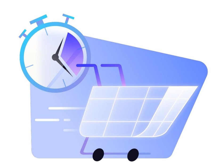
Illustration of a stopwatch overlaid on a shopping cart, symbolizing fast, on-demand grocery delivery
Discovering the best entry point for on-demand delivery.

The Ocado Smart Platform (OSP) provides the e-commerce backbone for major international grocery retailers — but a fast, on-demand delivery option was a key missing piece, representing an estimated £1.1bn incremental retail sales opportunity by 2027. I led the research for "On-Demand on OSP": enabling sub-60-minute delivery integrated directly into existing retail apps — Morrisons in the UK, Panda in Saudi Arabia — so customers could shop under the same banner for both their weekly scheduled shop and their urgent, immediate needs.

Challenge

The challenge was integrating a fundamentally different shopping mode into an architecture built for planned, next-day delivery. Early on, it became clear that a fully separate "overlay" experience would take too long to build, so the team pivoted to a pragmatic approach: a Delivery Destination Selector (DDS+) letting users choose their region and delivery type early in the journey.

Scale of the initiative

Beyond the technical challenge, this was a highly cross-functional initiative spanning multiple markets, streams, and teams — a significant stakeholder management undertaking in its own right:

3

UX Designers involved

5

Product Managers involved

10

Teams involved — 6 engineering squads, data, tech comms & 2 Solutions teams (Account Management & Operations)

Research objectives

The core research objectives became:

  • How to make fast delivery easy to discover
  • Let people switch smoothly between delivery modes
  • Set honest expectations about the trade-offs — limited product range, different pricing, minimum spends — without disrupting shopping habits users already trusted

1Scoping the MVP: pragmatic over perfect

The project came with three hard constraints:

  • A fixed deadline to unblock two retail partners (Morrisons and Panda)
  • A tight technical window with limited development capacity
  • Real complexity — different streams, domains, teams and markets all needing to move together
Three challenges: a fixed deadline to unblock two retail partners (Morrisons and Panda), technical constraints around limited dev capacity and what could be built in 7 months, and complexity from different streams, domains, teams, markets, and dependencies
The three core challenges: a fixed deadline to unblock two retail partners, tight technical constraints, and the complexity of coordinating across streams, domains, teams, and markets.

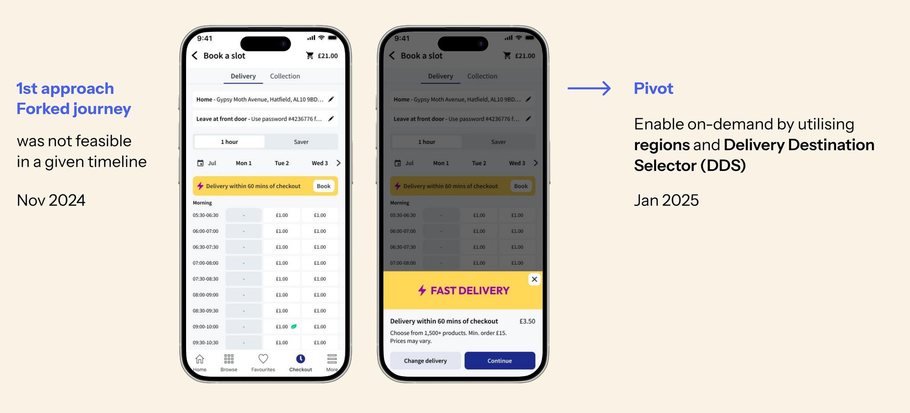
The first approach — a fully separate "forked" journey — wasn't feasible in the time available. In January 2025 the team pivoted to a leaner model: enabling on-demand by utilizing regions and the existing Delivery Destination Selector (DDS+), adapting infrastructure that already existed rather than building a parallel one from scratch.

Two versions of the Book a Slot screen: the first approach with a fully separate forked journey (Nov 2024), and the pivot enabling on-demand via regions and the Delivery Destination Selector, DDS+ (Jan 2025)
The first "forked journey" approach (Nov 2024) wasn't feasible in the given timeline. The team pivoted (Jan 2025) to enabling on-demand through regions and the Delivery Destination Selector instead. Designed by Ewelina Bidzińska-Gębusia, UX Designer.

2Discovery: why do people turn to on-demand?

This phase built on earlier generative discovery research led by two colleagues from the research team, who first built empathy for on-demand users through in-depth interviews and surveys. They ran a 100-user survey per market across the UK, Spain and Canada, plus 16 in-depth interviews, to define the three core on-demand user missions.

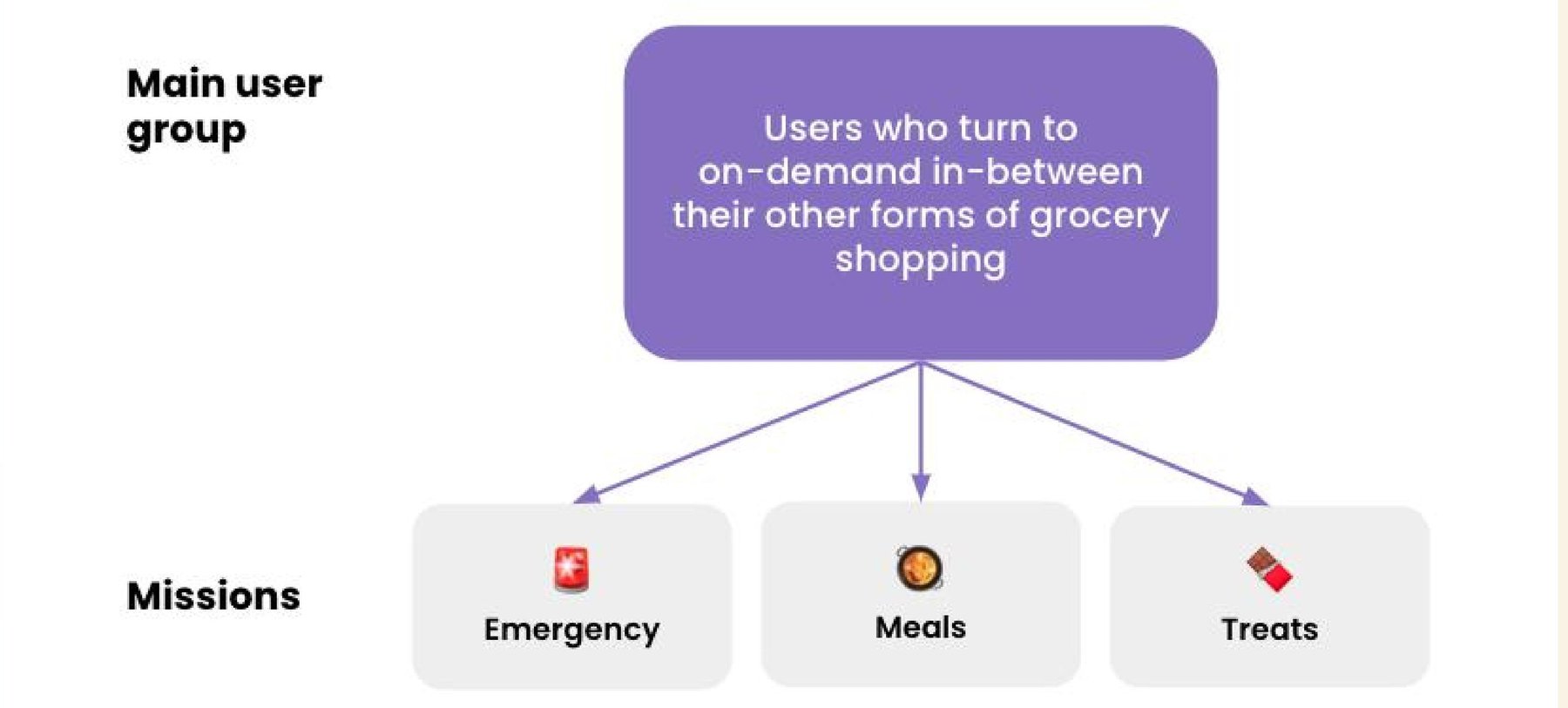
Diagram showing the main user group for on-demand — users who turn to on-demand in-between their other forms of grocery shopping — split into three missions: Emergency, Meals, and Treats
On-demand users weren't a new customer type — they were existing shoppers reaching for on-demand in between their regular grocery habits, for one of three missions: Emergency, Meals, or Treats.

Key insights

Four insights from this stage shaped everything that followed:

Speed of shop

A fast, streamlined shopping experience would be welcomed by users.

Transparency over delivery time

Users need clarity on delivery time at the very start of the shopping journey, not buried later.

Adoption by existing customers

Combining on-demand under the same banner was likely to encourage adoption by existing OSP customers.

Mobile app first

An on-demand solution on the mobile app would feel most familiar and offer the most convenience.

3Concept and usability testing across the UK and Saudi Arabia

I ran moderated and unmoderated usability testing on mobile and desktop prototypes across the UK and Saudi Arabia (for our partner Panda), evaluating the DDS+ entry points and a new map-based address creation flow.

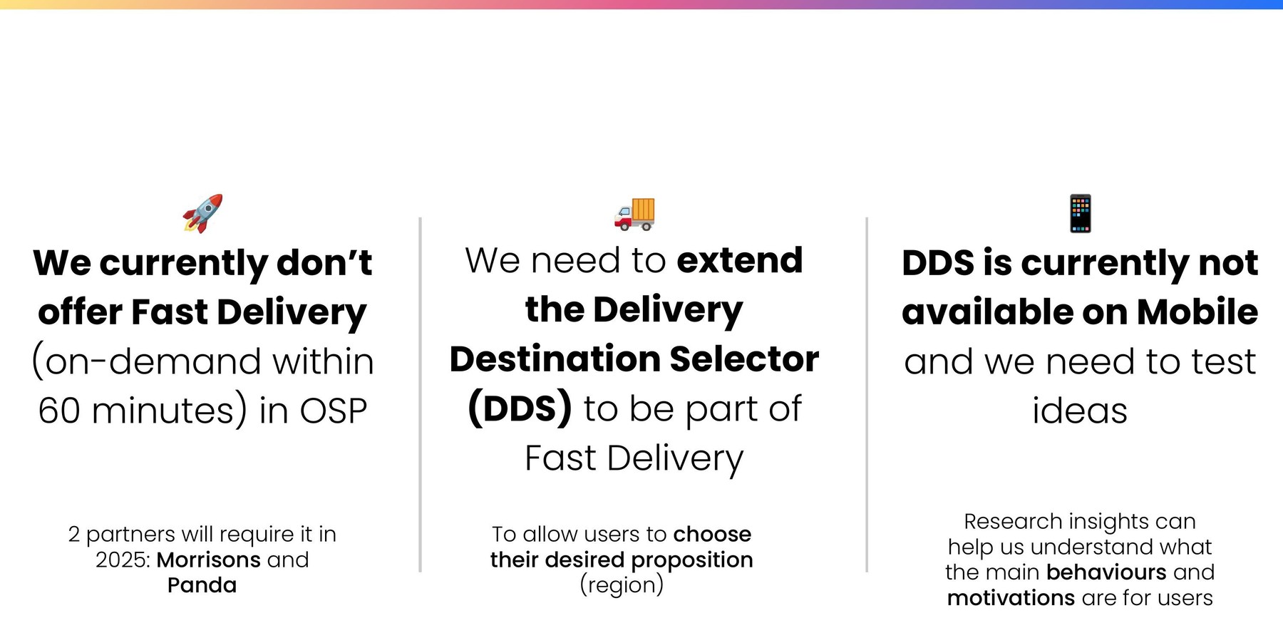
Three reasons for the research: OSP currently doesn't offer fast delivery and 2 partners (Morrisons and Panda) require it in 2025; the Delivery Destination Selector needs to extend to support fast delivery; and DDS is not yet available on mobile and needs testing
The rationale behind this concept testing phase: fast delivery wasn't yet offered in OSP, the Delivery Destination Selector needed to extend to support it, and DDS wasn't yet available on mobile.

UX Challenges

Each round of testing surfaced a concrete UX problem, and fed directly into a solution the team then designed and shipped:

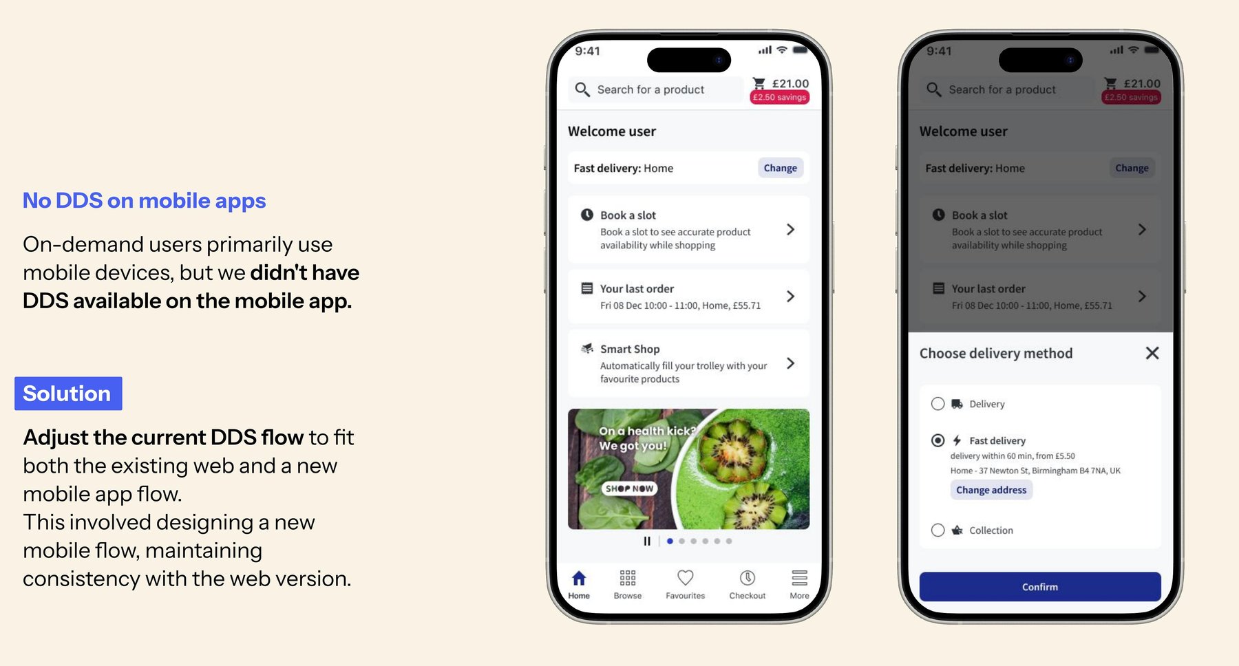
Before and after: no Delivery Destination Selector on the mobile app, then the solution adjusting the DDS+ flow to fit both web and a new mobile app flow
No DDS+ on mobile apps. On-demand users primarily shop on mobile, but the Delivery Destination Selector didn't exist there yet. Solution: adjust the current DDS+ flow to fit both the existing web experience and a new mobile app flow, designed for consistency across both. Designed by Ewelina Bidzińska-Gębusia, UX Designer.
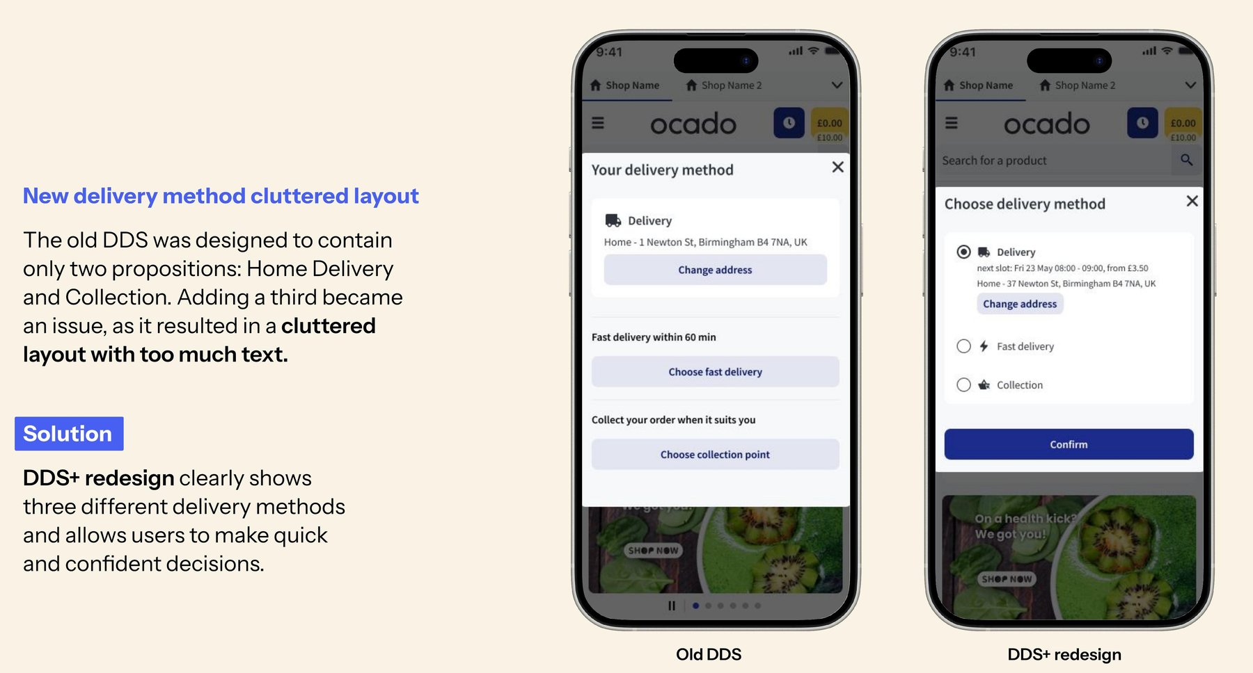
Before and after: the old delivery method screen with only two options became cluttered when a third was added, then the DDS+ redesign clearly separates all three delivery methods
A cluttered new delivery method screen. The old DDS was designed to hold only two propositions — Home Delivery and Collection. Adding a third made it cluttered and text-heavy. Solution: the DDS+ redesign clearly separates all three delivery methods, helping users make quick, confident decisions. Designed by Ewelina Bidzińska-Gębusia, UX Designer.
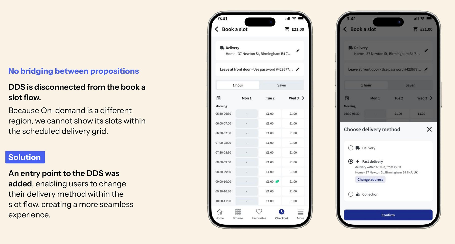
Before and after: no way to switch delivery method from within the Book a Slot flow, then an entry point added directly inside that flow
No bridging between propositions. Because on-demand was a different region, its slots couldn't be shown within the standard scheduled-delivery grid — leaving no way to move between the two from the Book a Slot page. Solution: an entry point to DDS+ was added directly inside the slot flow, creating a more seamless experience. Designed by Ewelina Bidzińska-Gębusia, UX Designer.
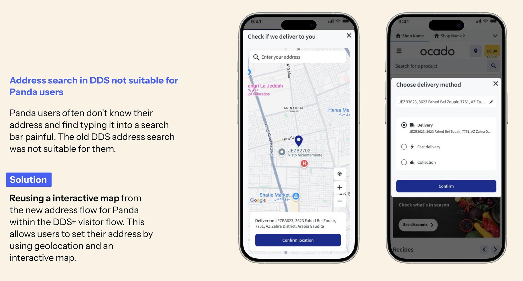
Before and after: a text-based address search unsuitable for Panda users in Saudi Arabia, then an interactive map with geolocation reused from the new address flow
Address search didn't suit Panda users. Many Panda (Saudi Arabia) users don't know their formal address and found typing it into a search bar painful. Solution: reuse the interactive, geolocation-based map from the new address flow within the DDS+ visitor journey, letting users set their address by dropping a pin. Designed by Ewelina Bidzińska-Gębusia, UX Designer.

4Validating on the live Morrisons MVP

Once "Morrisons Now" launched, I ran unmoderated online usability testing with 20 current Morrisons customers (mobile and desktop users) to validate the end-to-end live experience — with particular focus on discovery of the new proposition and the friction of switching between standard and fast delivery.

"They've removed my bread... my bread's gone... That's something I really dislike. Items seem to just vanish." — on switching from fast back to scheduled delivery and losing basket items silently

"If I already chose fast delivery, why do I still need to book? That's so confusing! I have no idea where the 'Book Now' button will take me." — on being asked to book a slot for a sub-60-minute delivery

Research objectives

  • Discover the best entry point for on-demand delivery
  • Understand on-demand users' decision making process when using DDS+ and choosing their delivery options
  • Understand users' experience and expectations with the new version of the Delivery Destination Selector (DDS+)
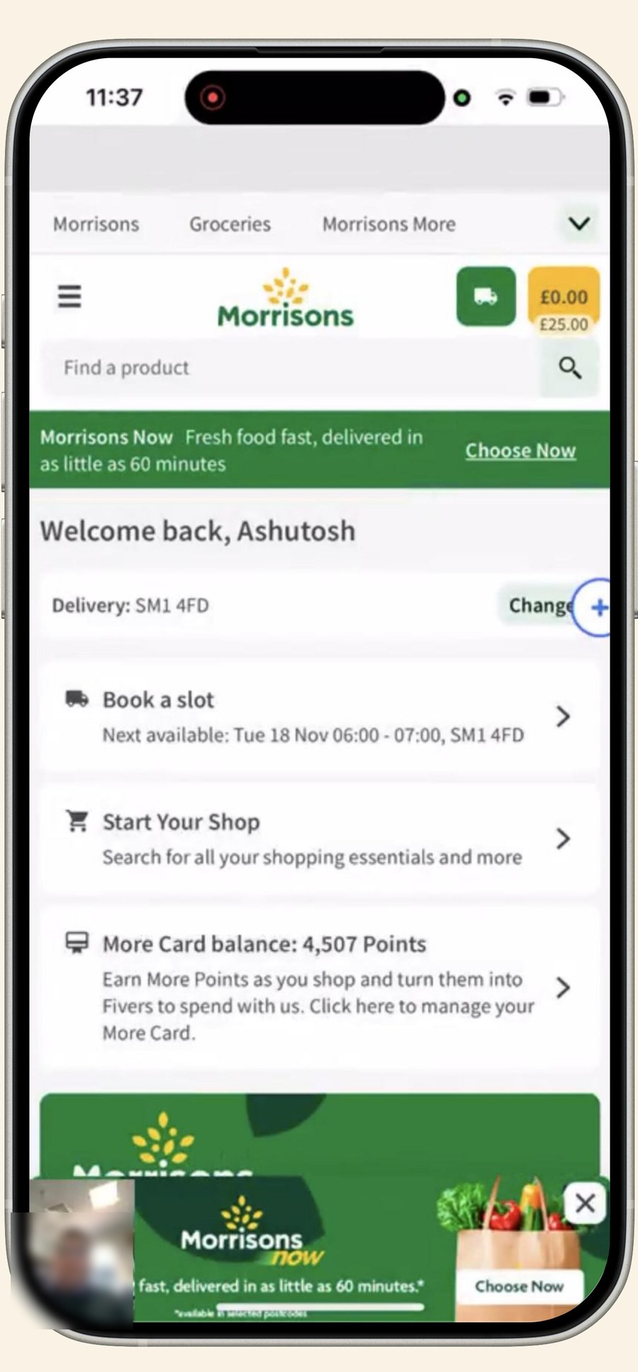
The live Morrisons app homepage showing the Morrisons Now banner advertising fresh food delivered in as little as 60 minutes
The live Morrisons MVP, tested with 20 current customers. Participant identifying details have been blurred for this public case study. Designed by Ewelina Bidzińska-Gębusia, UX Designer.
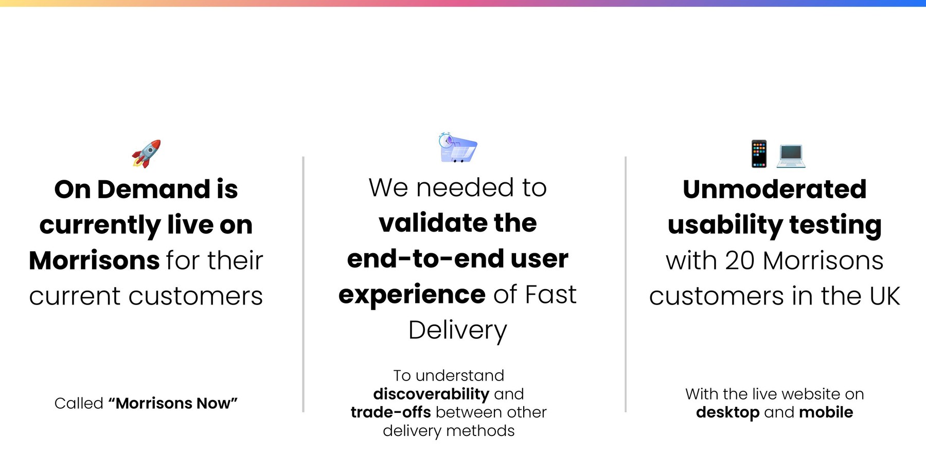
Three reasons for the live study: On-Demand (Morrisons Now) is currently live on Morrisons for their current customers; we needed to validate the end-to-end user experience of Fast Delivery, understanding discoverability and trade-offs; unmoderated usability testing with 20 Morrisons customers in the UK on the live website, desktop and mobile
The rationale behind the live study: "Morrisons Now" was already live for current customers, and we needed to validate the end-to-end experience — discoverability and trade-offs — through unmoderated testing with 20 Morrisons customers on desktop and mobile.

Key Findings

While the 60-minute delivery proposition delighted users, the execution surfaced significant friction:

Discovery is low

Most users defaulted to their standard "search first" shopping habit, overlooking the "Morrisons Now" banner entirely — 75% of participants (15 of 20) missed it completely.

Switching is high friction

Most users struggled to find the mechanism to switch between "Morrisons Now" and scheduled delivery, expecting it to live within the familiar Book a Slot flow.

"Dead ends" frustration

Users who weren't eligible for fast delivery hit dead ends with no clear feedback or next action.

The "slotless" expectation

For a sub-60-minute delivery, being asked to "book a slot" felt entirely redundant and confusing.

Hidden fees, minimum spends, and late notices of unavailability also eroded trust — transparency turned out to be a deal-breaker, not a nice-to-have, for both markets.

5Cross-market insights: UK and Saudi Arabia

As lead researcher on a global platform, it was critical that the solution wasn't UK-centric. Comparing moderated usability testing in the UK against Saudi Arabia (for Panda) surfaced cultural and behavioral nuances that directly shaped the localized designs:

🇬🇧 UK

  • Some price sensitivity remains: users actively sought guest checkout for quick, one-off urgent purchases.
  • Trust through tracking: real-time driver tracking was highly valued to guarantee delivery times.
  • Cross-device: users moved between desktop and mobile web/app.

🇸🇦 Saudi Arabia (KSA)

  • Speed over price: on-demand is already an ingrained, primary shopping method — in time-sensitive moments, users prioritize speed over price entirely.
  • Higher address granularity: participants wanted fields for villa vs. apartment, and even suggested uploading a photo of their building so drivers wouldn't get lost.
  • Mobile-only: on-demand shopping happened almost exclusively via the mobile app.

Both markets shared one non-negotiable: fast delivery becoming unavailable after a user had already started their journey was the ultimate deal-breaker. KSA users in particular said they would abandon the app immediately and switch to a competitor:

"If there's no fast delivery and I need this product today, I'll look for another app that can deliver." — Saudi user

This underscored the necessity of transparent, upfront communication about delivery eligibility and fees, before a user invests time building a basket.

6Shipping the MVP: impact and roadmap

The Morrisons On-Demand MVP, "Morrisons Now", went live in September 2025. Within the first 8 weeks it delivered a strong volume of orders with a healthy average order value and a solid on-time delivery rate. The "same-banner" strategy proved effective too: roughly two-thirds of On-Demand customers came from Morrisons' existing customer base, validating the core premise that on-demand could ride on trust already built with regular shoppers.

Actionable Recommendations

The live usability findings directly reshaped the product roadmap. We provided actionable recommendations that helped prioritize capabilities that were already in the roadmap:

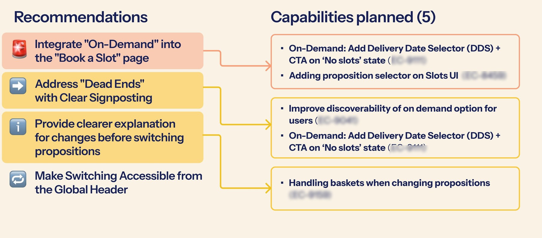
  • ✅ Integrate "On-Demand" directly into the "Book a Slot" page, rather than relying on banners users don't notice.
  • ✅ Address "dead ends" with clear signposting when a user isn't eligible for fast delivery.
  • ✅ Provide a clearer explanation of what changes before a user switches delivery propositions.
  • ✅ Make switching between propositions accessible from the global header, not buried in a sub-flow.
Diagram mapping four research recommendations — integrating On-Demand into the Book a Slot page, addressing dead ends with clear signposting, clearer explanation before switching propositions, and making switching accessible from the global header — to five capabilities already planned on the roadmap, with internal ticket references blurred
Each recommendation was mapped directly to capabilities already planned on the roadmap, helping the team prioritize what to build next. Internal ticket references are blurred for this public case study.

Generating empathy and partner buy-in

To build genuine empathy for these findings and get them acted on, insights were shared in three complementary formats: an insights report with video clips embedded alongside each finding and its recommendations, showing users in action rather than describing them; a live "watch party" where those insights and clips were shared with all stakeholders, including engineers, generating far more empathy than a written report on its own; and a direct presentation to Morrisons, sharing the same insights, video clips, and next steps with the retail partner — which resulted in them prioritizing capabilities and requests from their end.

Three formats used to generate user empathy: an insights report with embedded video clips for each insight and recommendation, a watch party sharing insights and videos with all stakeholders including engineers, and a partner presentation sharing insights and video clips with Morrisons that helped prioritize capabilities
Three formats for generating empathy: an insights report with embedded video clips, a stakeholder "watch party," and a direct partner presentation to Morrisons.

Benefits for retail partners

  1. Competitive parity — both the UK and Saudi markets already had strong on-demand offerings from other players; this let partners compete directly.
  2. Top-ups fulfilled in-app — retaining more weekly spend inside the retailer's own app, rather than losing it to a rival on-demand service.
  3. One app, two missions — scheduled and on-demand shopping in a single app met market expectations while cutting running and maintenance overhead.
  4. Lower customer acquisition cost — on-demand under an existing, trusted banner is cheaper to acquire customers for than a standalone service.
  5. Local stores as immediacy hubs — unlocking incremental sales from the store network itself.

Beyond Morrisons, the same DDS+ foundation proved scalable: Sobeys (Canada) initiated an A/B test of the delivery-selection framework in their own market; Alcampo (Spain) and Auchan (Poland) entered early discussions to adopt the unified functionality; and Ocado Retail (UK) began reviewing our design plans and next steps for their own future integration. Successfully validating this approach positions Ocado Group to pursue the full ~£1.1bn incremental retail sales opportunity, with an estimated ~£20m in gross profit by 2027 across the international partner network.

7Scaling insights with AI (NotebookLM)

With the live Morrisons study wrapped and a fast-growing library of cross-market research behind it, I extended an approach I'd already built on the First Time Shopper project: turning the research into a living, queryable resource instead of a static report.

I built two dedicated NotebookLM repositories, each scoped to a different audience:

  • Morrisons Live On-Demand Notebook — scoped specifically to the live MVP usability study; Ewelina and I used this directly for analysis and synthesis of the 20-user test.
  • On-Demand OSP Notebook — a broader repository spanning all prior research and product documentation across markets and partners (UK/Morrisons, Panda), giving stakeholders self-service access to cross-market findings.

Building AI governance

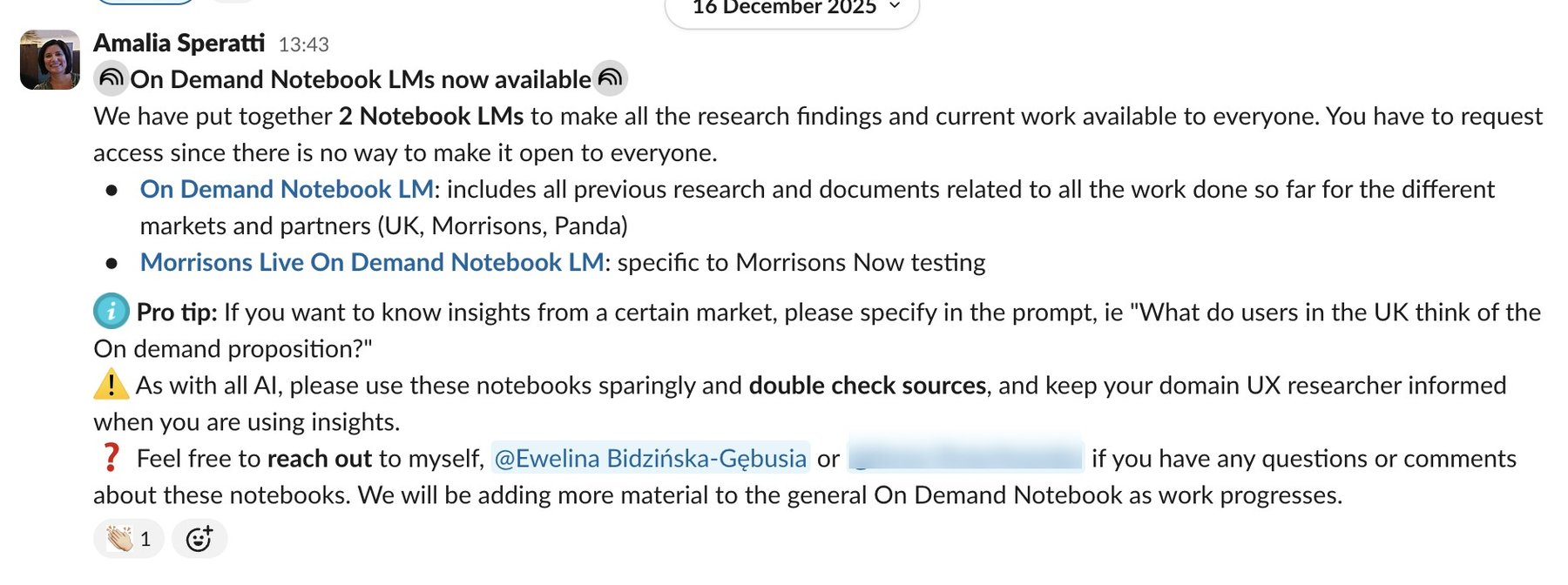
As with First Time Shopper, I built governance in from day one: guidance to specify a market in prompts for more precise answers (e.g. "What do users in the UK think of the On-Demand proposition?"), and a clear disclaimer to use the notebooks sparingly, double-check sources, and keep the domain UX researcher informed before acting on AI-generated insights.

Slack announcement introducing the two On-Demand NotebookLMs, with a pro tip on specifying markets in prompts and a disclaimer to double-check sources
Launch announcement for the two On-Demand NotebookLMs, with the same governance guardrails used on First Time Shopper.
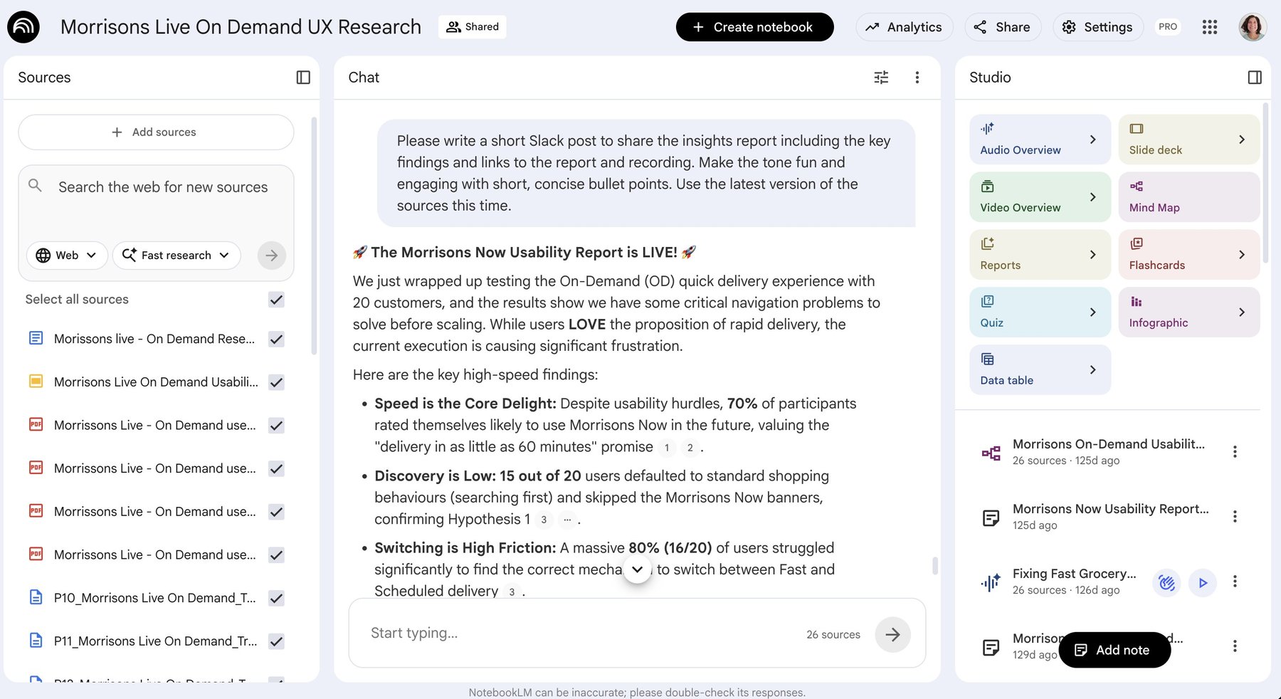
The Morrisons Live On-Demand NotebookLM interface, showing a chat query asking for a shareable summary of the usability report's key findings
The Morrisons Live On-Demand NotebookLM — Ewelina and I used this directly to analyze and synthesize the 20-user usability study, and to draft shareable summaries of the findings.

8My role

As Senior/Lead UX Researcher, I led this initiative end-to-end as follows:

End-to-end research leadership

Led the multi-phase, mixed-methods strategy end-to-end — from generative discovery through concept testing to post-launch validation — de-risking the initiative at every stage instead of running one large study too late to act on, and pushing an "MVP over perfect" philosophy throughout.

Close design & product partnership

Partnered closely with the UX Designer on research planning and analysis alongside the design work, and with the Product Manager in an ongoing relationship already established from the First Time Shopper project.

Stakeholder management & coordination

Coordinated across engineering planning, Solutions (Operations) managers, and data analytics given the cross-stream scope, and joined engineer-facing workshops led by the UX Designer.

Presented at the Ecom Demo

Presented the research together with the Product Manager and UX Designer at the ecom-wide Demo marking the first MVP launch in Morrisons.

This built directly on earlier generative discovery work by two colleagues from the research team who first surfaced the on-demand user need. Usability testing in Saudi Arabia was run by Askable with support from Solutions; UK sessions were run together with another UX Researcher from the team.

B2B · Content & Monetization

Content Management & Strategy

Ocado Technology · Jan 2023 – Sept 2024 · 5 retail partners across the UK, Spain, Sweden, Japan & Canada

Colorful gradient title card reading Content Management and Strategy, UXR Insights
Bringing structure to a fragmented content and retail media landscape.

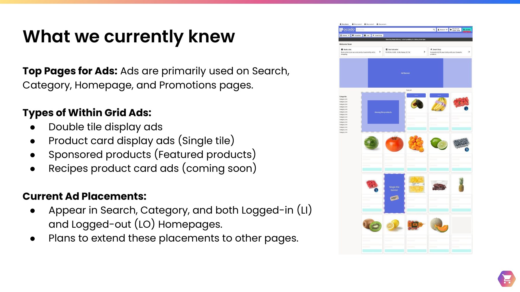
Ocado Technology's retail partners rely on Contentful — OSP's content management system — to create and manage the ad campaigns, banners, and static pages that power their retail media business. Over 2023–2024, I led three interlocking research studies — Content Management, Static Content Pages, and Content Strategy — to understand how content editors, marketing managers, and retail media managers across five partner retailers actually plan, create, and monetize content, giving OSP's Monetization domain a clear, evidence-based roadmap.

Project goal

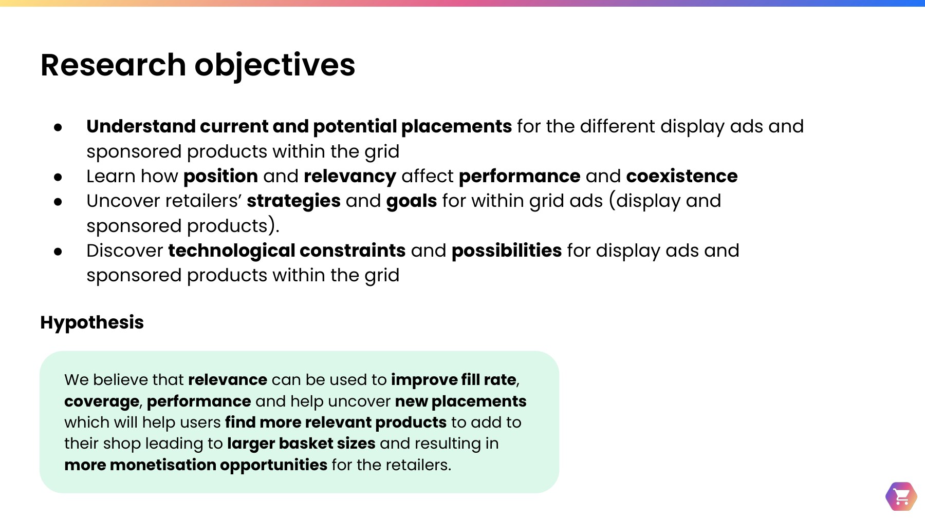
The goal was to uncover content editors' pain points and delights managing content in Contentful, and to understand how retail partners plan, execute, and monetize their content and retail media strategies — on-site and off-site — so the team could prioritize the right product investments.

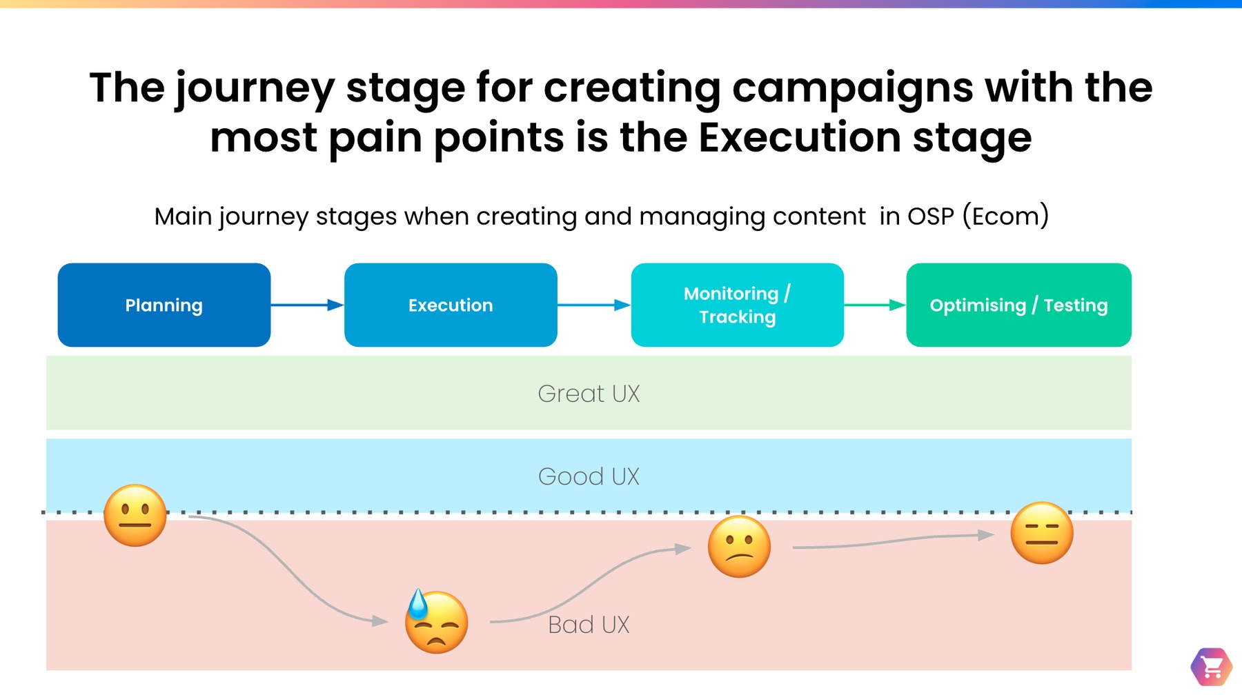
Diagram of the main journey stages for creating and managing content in OSP: Planning, Execution, Monitoring and Tracking, and Optimizing and Testing, with a color band showing UX quality from great to bad across each stage, highlighting Execution as having the worst UX
Across the content journey — Planning, Execution, Monitoring/Tracking, and Optimizing/Testing — Execution surfaced the most consistent friction for partners.

Summary and challenge

The team faced a fragmented landscape: partners managing content across multiple platforms — Contentful, legacy in-house CMSs, Lokalise, CitrusAd, and even Wordpress — with regions ranging from 20 to over 400 per partner, and no two partners working the same way. The research had to surface patterns robust enough to prioritize a shared product roadmap, not just document five different ways of doing things.

1Research approach: three interlocking studies

The research ran in three phases feeding one continuous body of evidence: Content Management (Jan 2023 – Feb 2024), Content Strategy (May – Aug 2023), and Static Content Pages (Sept 2024) — each a round of 60-minute in-depth interviews with screen share, supplemented by secondary research pulled from related projects (Composable UI, Double Tile research, Search Clusters/Bulk Banner Actions, and Ads within Grid/Relevancy).

5

Retail partners: ORL (UK), Alcampo (Spain), ICA (Sweden), Aeon (Japan) & Sobeys (Canada)

19

Participants — content editors, marketing & retail media managers, sales specialists

3

Interlocking studies run across 20 months

Research objectives

  • Uncover content editors' pain points and delights managing content in Contentful
  • Understand how retailers plan and monetize content on-site and off-site
  • Learn what retailers measure, how they track campaigns, and who the key stakeholders are

2Content Management: pain points across the journey

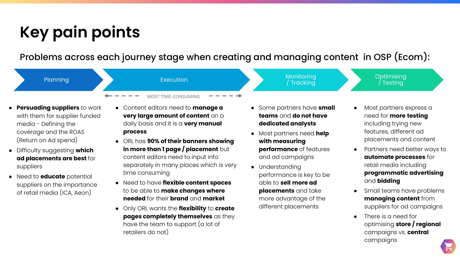
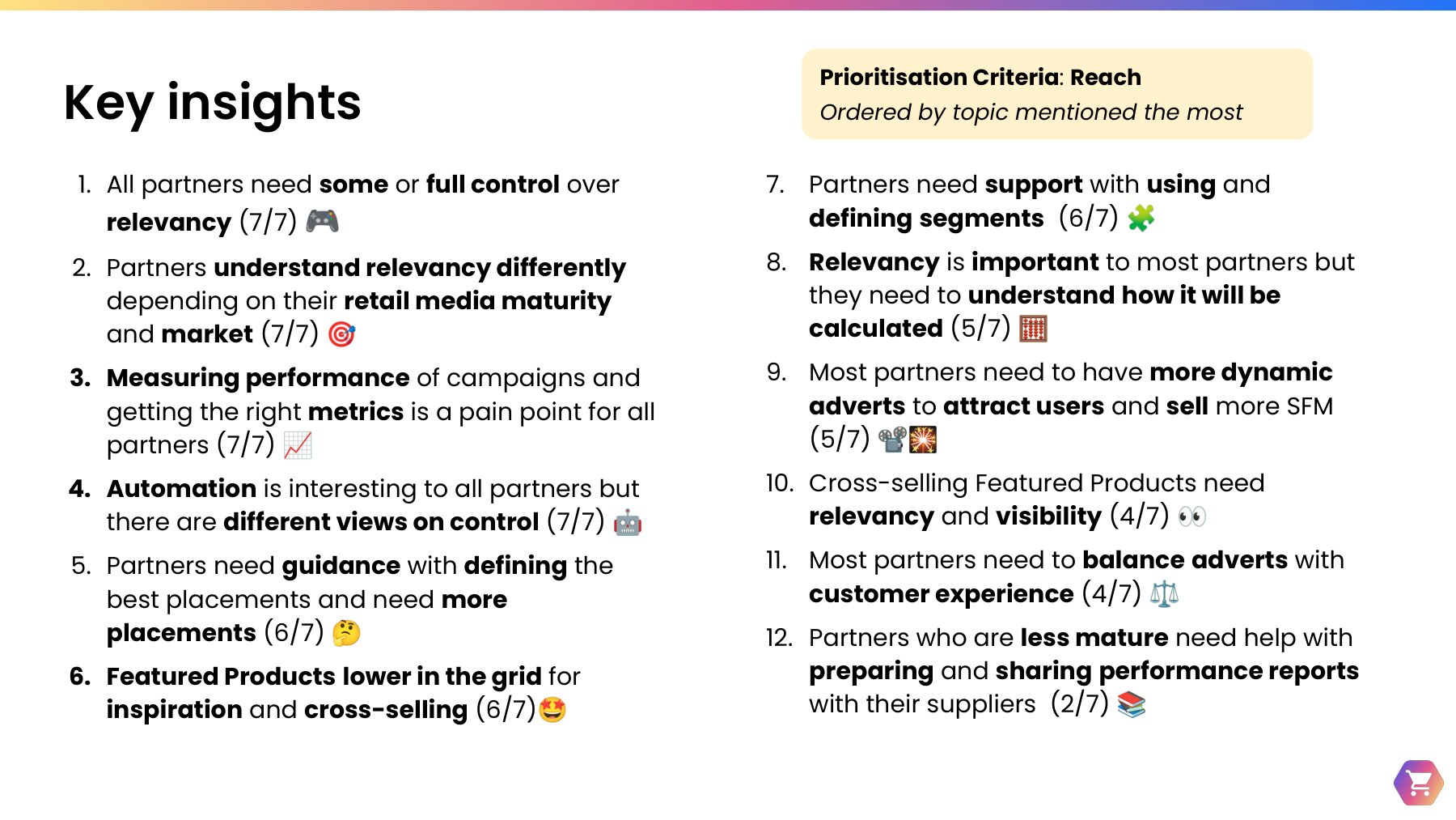
Content editors across every partner described the same core problem: managing a very large amount of content in a very manual process. 5 of 8 partners were using more than one CMS, which compounded the issue — one partner was juggling four separate content platforms at once. Content editors needed bulk actions (uploading, editing, publishing), the ability to plan and schedule content across regions and channels, and a reliable way to preview content before it went live — none of which existed at the time.

Table of key pain points across the Planning, Execution, Monitoring and Tracking, and Optimizing and Testing journey stages, with Execution flagged as the most time-consuming stage
Execution was the most time-consuming stage by far — content editors managing hundreds of banners and pages with no bulk tools, no preview, and no shared calendar.

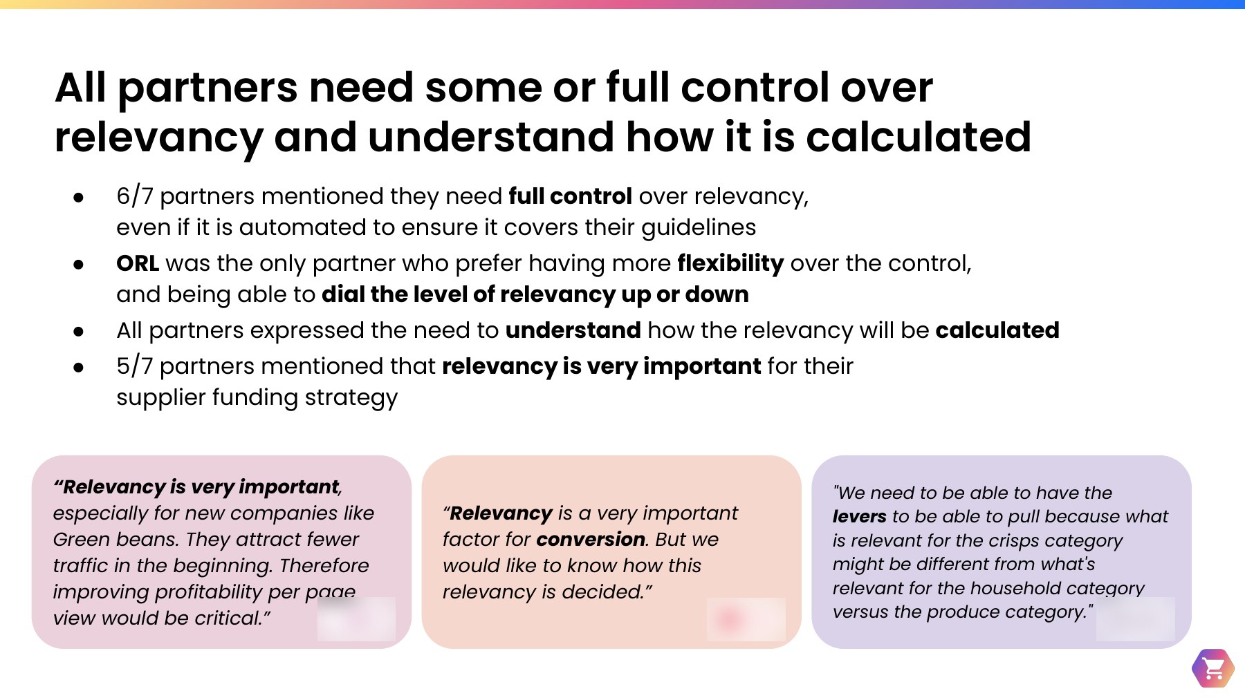
"It is a complex web of CMSs." — a content editor, retail partner in Sweden

Managing regions and languages added further complexity — partners ranged from 20 regions up to over 400, and one partner had to manage every piece of content in two languages per region. Content editors also flagged a lack of customization and theming for campaigns and static pages, and a need to target content via segmentation to reach the right customers.

Service blueprint

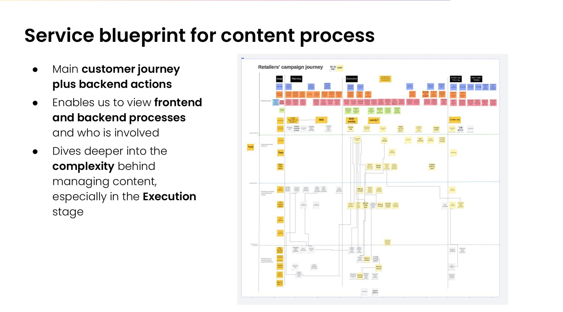
To go beyond the customer-facing journey, I created a service blueprint — with support from a fellow researcher — mapping the main customer journey plus the backend actions behind it. It let the team view frontend and backend processes side by side, and who was involved in each, diving deeper into the complexity behind managing content, especially in the Execution stage.
Service blueprint for the content process: a retailers' campaign journey board mapping the main customer journey stages — Planning, Execution, Monitoring/Tracking, and Optimizing/Testing — against backend tools, teams, and actions
The service blueprint mapped frontend and backend processes side by side, surfacing the hidden complexity behind managing content — especially in the Execution stage.

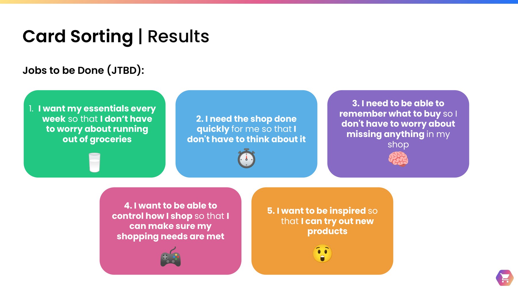
3Personas & Jobs to be Done

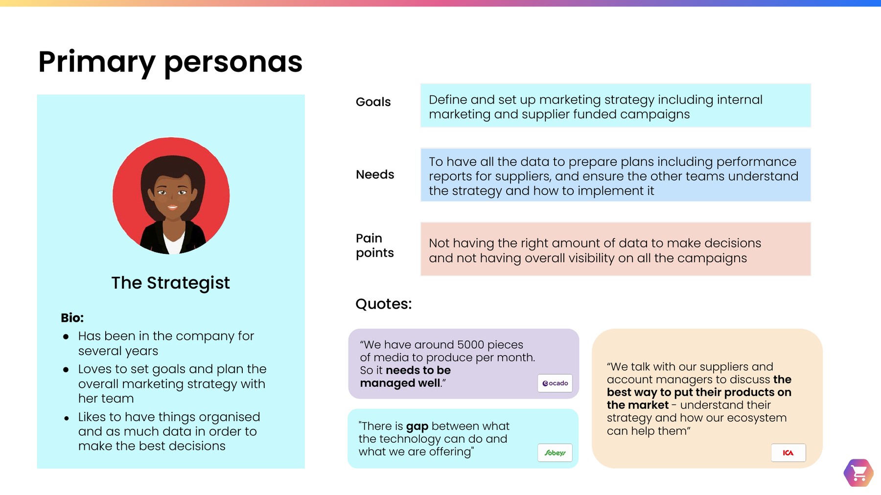
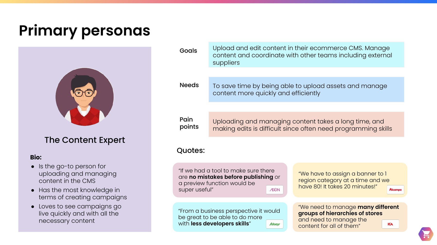
Synthesizing across both the Content Management and Content Strategy interviews surfaced two primary personas with distinct goals, needs, and pain points — one focused on strategy and reporting, the other on hands-on content production:

Persona card for The Strategist: defines marketing strategy including internal and supplier-funded campaigns, needs data to prepare performance reports, and struggles with visibility across all campaigns
The Strategist — defines marketing strategy and needs full visibility across campaigns to report back to suppliers.
Persona card for The Content Expert: uploads and edits content in the ecommerce CMS, needs to save time managing content efficiently, and struggles with slow, manual uploads and edits
The Content Expert — the go-to person for uploading and managing content, blocked by slow, manual workflows.

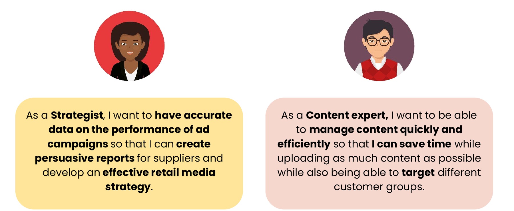
Jobs to be Done

  • As a Strategist, I want accurate campaign performance data so I can build persuasive supplier reports and an effective retail media strategy.
  • As a Content Expert, I want to manage content quickly and efficiently so I can save time while targeting different customer groups.
Jobs to be Done illustration: The Strategist wants accurate ad campaign performance data to create persuasive supplier reports and an effective retail media strategy; the Content Expert wants to manage content quickly and efficiently to save time while targeting different customer groups
Jobs to be Done for the two primary personas.

4Static Content Pages: the case for flexibility

Static pages — FAQs, delivery information, terms and conditions — don't feature products and rarely change, but most partners were still building and maintaining them by hand in HTML. That created real problems: platform security vulnerabilities, a dependency on technical expertise most content teams didn't have, inconsistent visual styles, and pages that only worked on web, not app.

The project aimed to shift toward a modular, componentized approach — enhancing platform security, simplifying content creation, improving style consistency, and making content accessible across both web and app.

Most partners preferred customizable templates over building from scratch, since few had developer capacity — but the more technically mature partners still wanted the option to use HTML for full creative flexibility. The clearest signal: updating existing HTML pages was consistently harder than creating them in the first place, which meant partners simply avoided updating pages that needed it.
5Content Strategy & Retail Media

Across partners, acquisition, retention, and loyalty were the consistent strategic priorities, alongside a push to connect the in-store and online experience into one omni-channel presence. Retail media itself was already a meaningful revenue stream — for one partner, sponsored content and supplier-funded media represented a significant, multi-million-pound annual revenue stream — which raised the stakes for getting the underlying tooling right.
Retail media maturity differences

NA*
AL
MOL
ICA
AEON
BP*
MP
LO
SOB
OCADO
Less mature
Mature

Retail media maturity varied widely across partners — and wasn't always linked to team size. Some retailer names have been abbreviated for this public case study.
*Positions were assumptions based on previous research and team size.

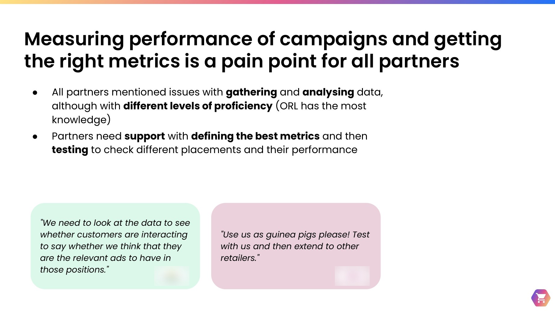
Personalization, targeting, and automation came up repeatedly as the levers partners most wanted — for bidding, segmentation, and performance reporting alike. But tracking performance was difficult for most partners: many lacked dedicated analysts, struggled to define the right metrics, and needed help educating their own suppliers on the value of retail media investment. Partners who were less mature in particular needed support preparing and sharing performance reports with suppliers.

"[Bidding] is essential because right now it is depleting our human resources. It takes a lot of manpower and man hours to set up and manage."

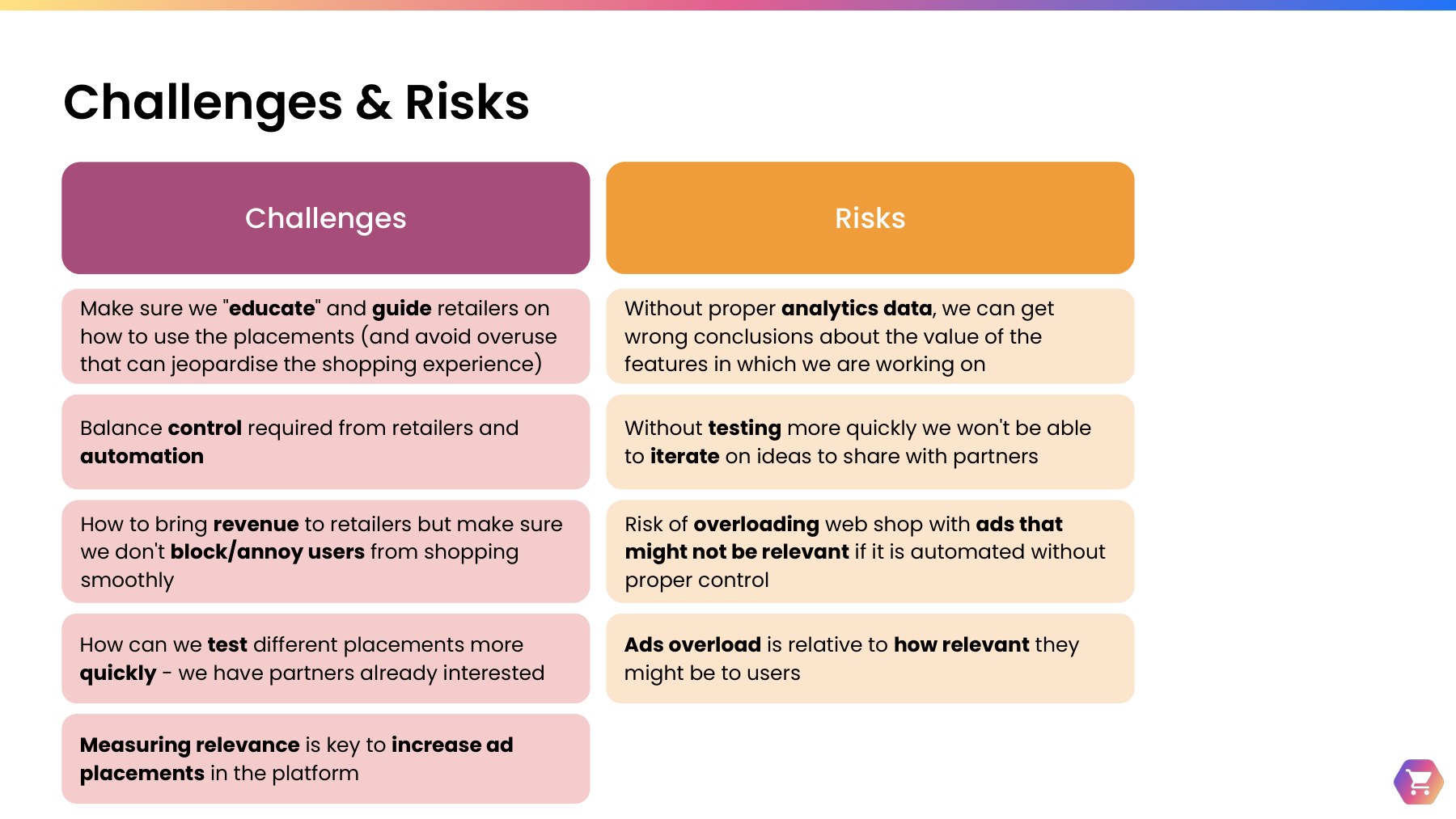
6Impact: from insights to recommendations

The findings converged on a clear set of priorities for the Monetization domain — sequenced from the most immediate efficiency wins to longer-term strategic capability:

Key Recommendations

Streamline processes for content editors to save time and reduce production costs

Allow more flexibility to customize e-commerce sites without compromising design consistency

Offer partners more personalization and targeting functionality

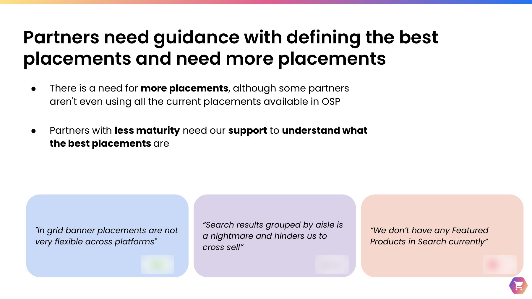
Guide partners on using ad placements for monetization, with the end customer in mind

Help partners track performance and turn data into informed decisions

Enable partners to run more tests with research and design support

Support partners in streamlining performance reporting for their suppliers

7Impact: from insights to shipped design

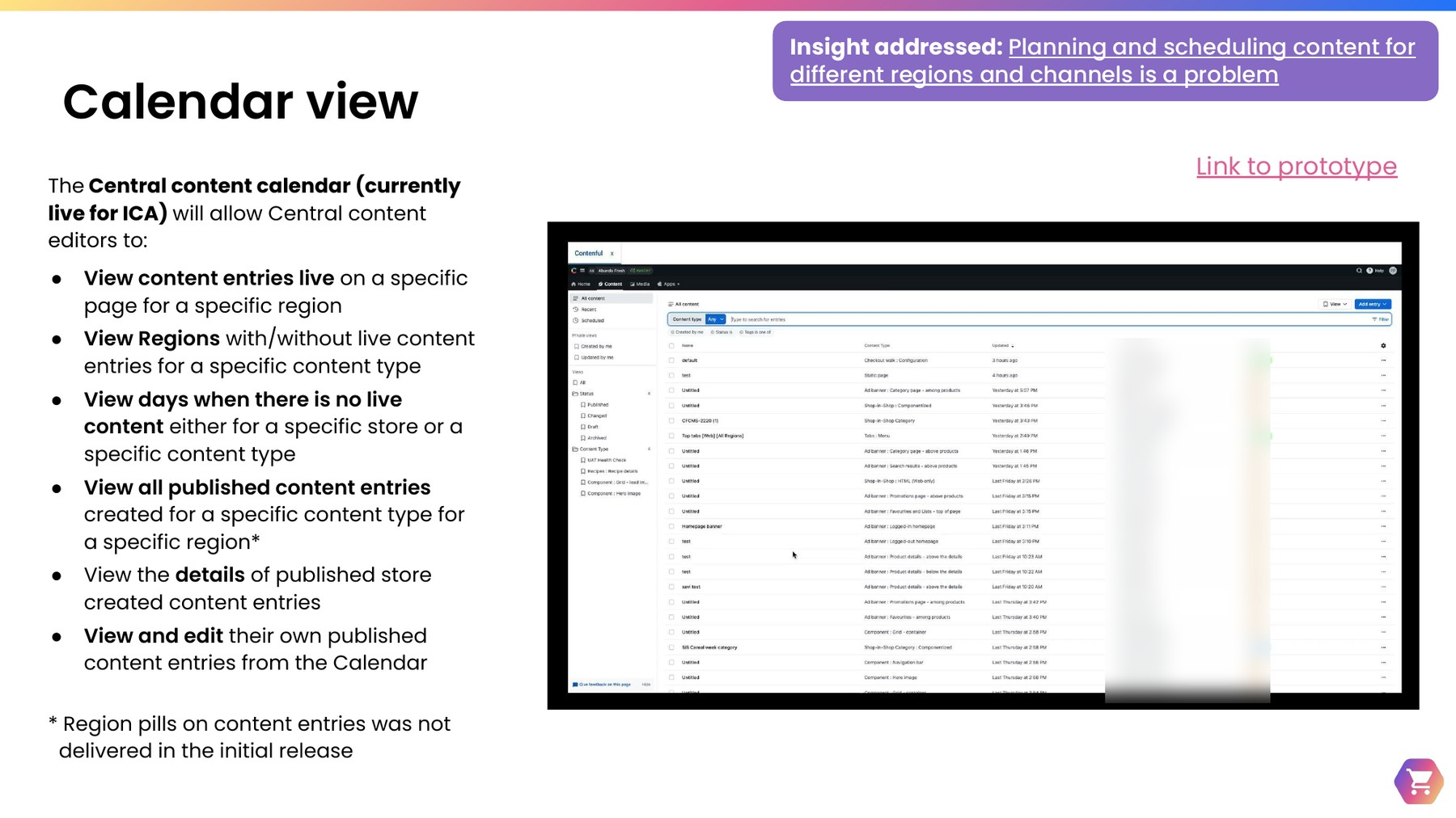
Each recommendation was mapped to a concrete design project, several of which shipped directly off the back of this research. The Central Content Calendar — now live for one partner — let content editors view and manage live content by region and content type for the first time, directly addressing the scheduling and visibility gap surfaced in Section 2.

Calendar view slide showing the insight addressed — planning and scheduling content for different regions and channels is a problem — alongside a screenshot of a Contentful content list view with entries, content types, and update timestamps, with the editor names column blurred for privacy
The Central Content Calendar, now live for one partner, directly addressing the scheduling and visibility gap — internal editor names blurred for this public case study.

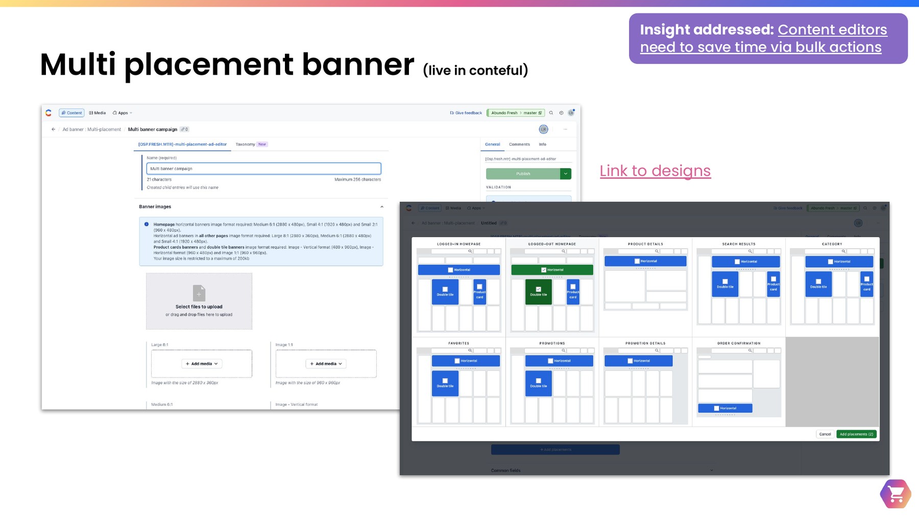
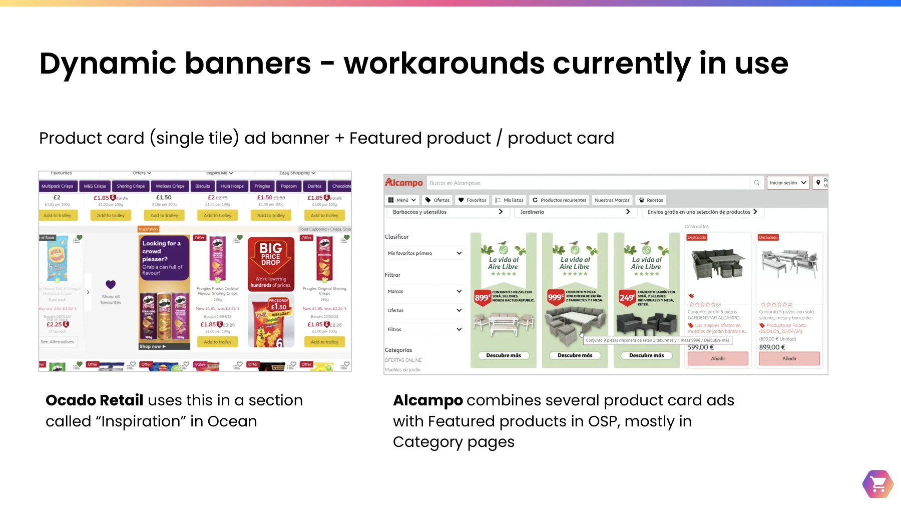
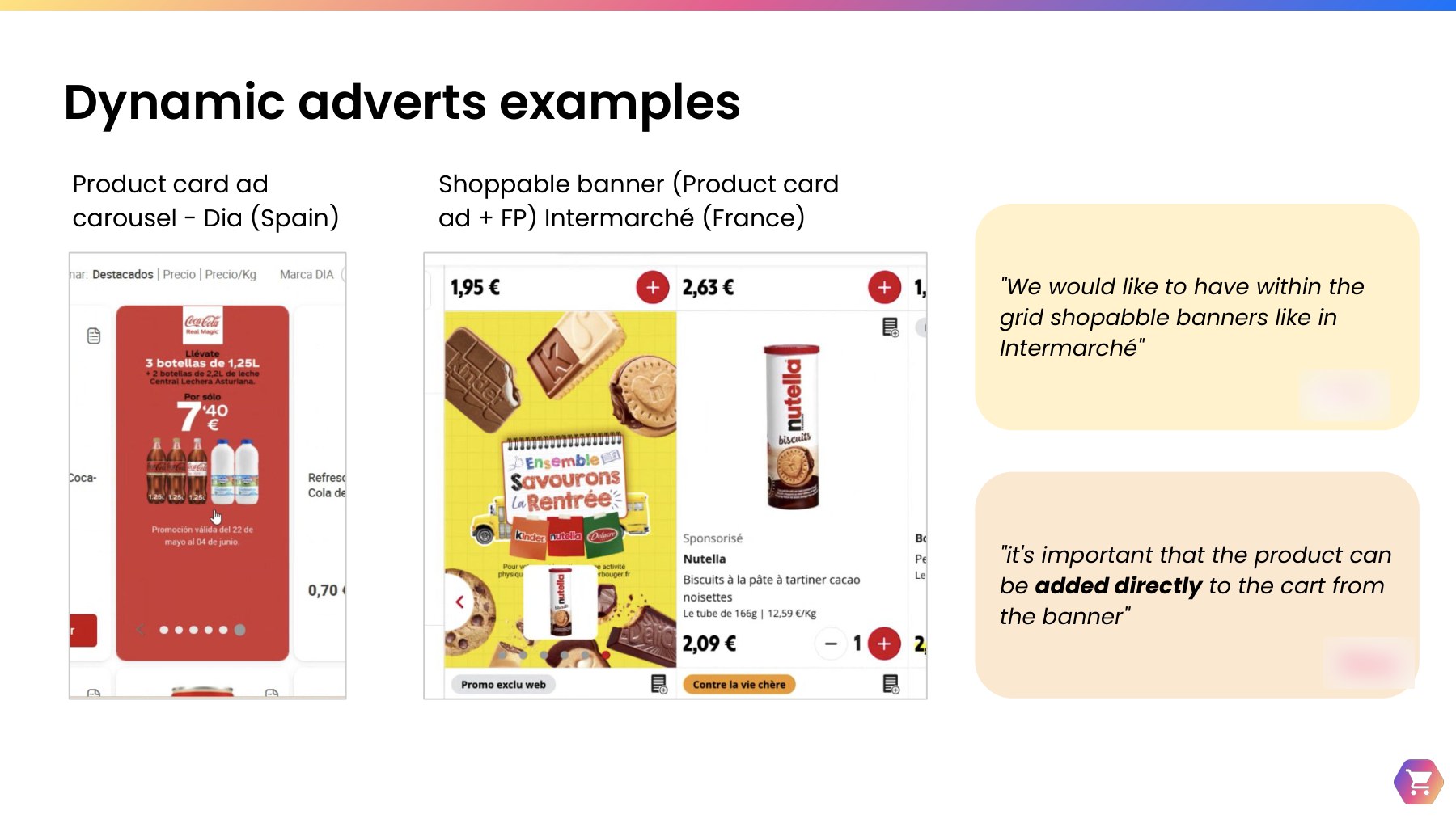
Bulk-action needs translated into shipped and prototyped solutions including a multi-placement banner tool (live in Contentful), search clusters, menu campaigns across groups of regions, and banner standardization — each targeting a specific, research-validated point of friction.

Multi placement banner design in Contentful and a corresponding homepage layout mockup, allowing one banner to be applied across multiple placements at once
The multi-placement banner tool, live in Contentful — one upload, applied across every relevant placement.

8My role

As Senior UX Researcher, I led this initiative end-to-end as follows:

End-to-end research leadership

Owned the research strategy across all three studies — scoping, recruiting, interviewing, and synthesizing 20 months of continuous research into one coherent set of recommendations.

Cross-functional collaboration

Partnered closely with Product Managers, including having them take notes and synthesize findings alongside me in interviews to build early empathy and buy-in — plus support from a fellow UX Researcher and two UX Designers. Engineering engaged closely too, with high participation in workshops and insight briefings that built their empathy and helped prioritize capabilities.

Stakeholder & domain alignment

Presented findings and recommendations directly to the Monetization domain, translating five partners' worth of nuance into one shared, prioritized roadmap. Also partnered closely with each partner's Solutions Manager, keeping them informed throughout and securing their buy-in and support to reach out to the retail partners.

Direct line to shipped design

Mapped major insights to a specific design project — from the Central Content Calendar to the multi-placement banner tool — and partnered closely with the UX Designers and PMs as they built the solutions, so recommendations translated into things that actually got built.

Want the full story behind any of these?

I'm happy to walk through methodology, artifacts, and outcomes in more depth.

Get in touch